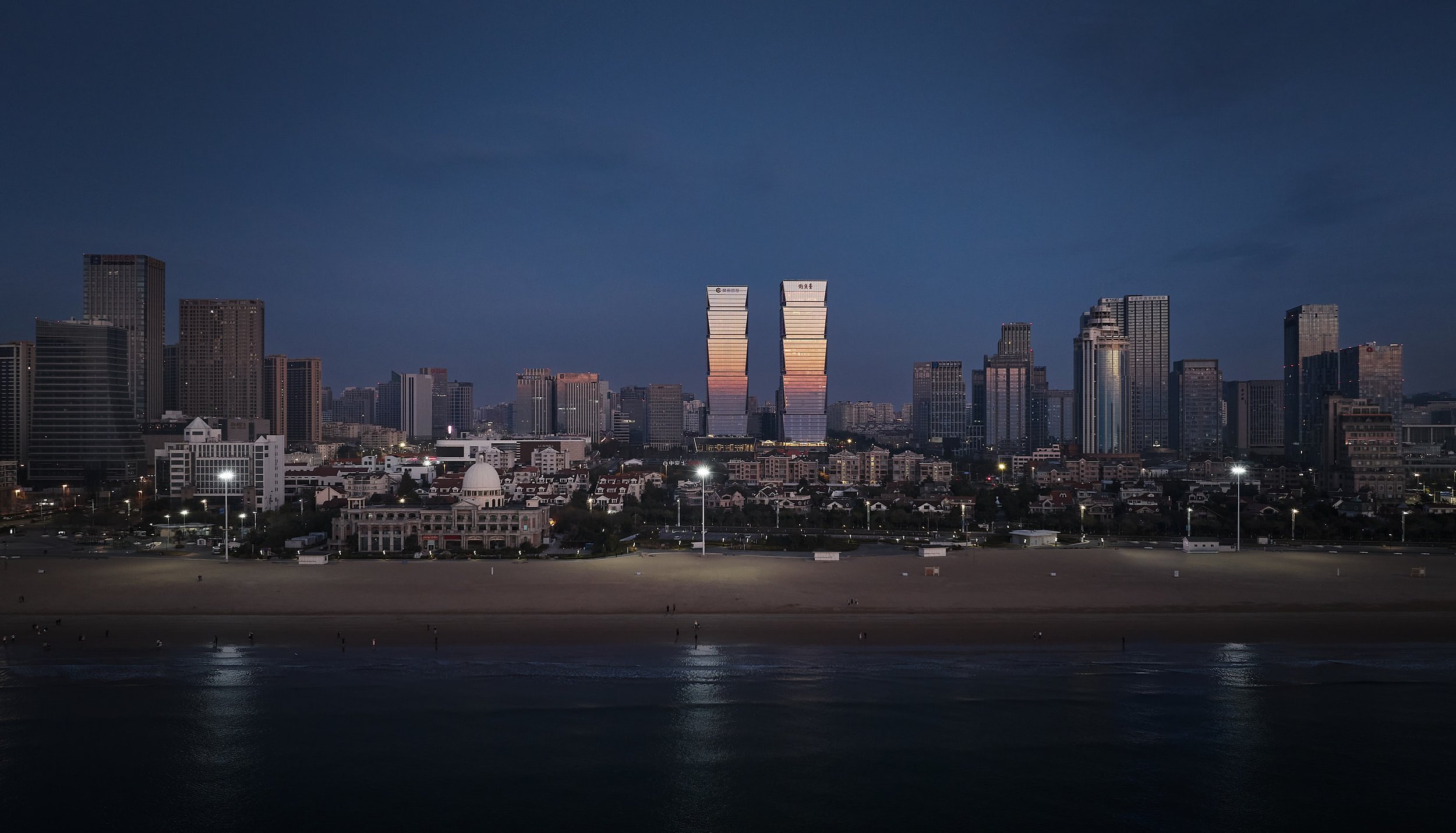
Emulating the Fushan Hill to the west and Laoshan Mountain to the east, Qingdao Financial City features a pair of iconic towers that create a new gateway for the city.
Qingdao Financial City is located centrally in the Qingdao Laoshan District and is an international, mixed-use development at the core of the Jinjialing new financial area. A high-value, regional and cultural landmark, the project consists of Class-A office space and luxury five-star hotels. Qingdao Financial City provides an urban center that balances modernity with timelessness and reinforces strong internal and external connections to the city. The project links directly to a large plaza south of the site, which offers a key gathering place and provides a venue where the client and tenants can host gatherings and festivals.
At 193-meters tall, each tower consists of five glass “jewel” boxes stacked vertically, symbolizing the prosperity of Jinjialing as a new financial center for the Northeast region of China. The glass boxes decrease in height as they ascend, forming a gradated, elegant silhouette. The shape of each box is chamfered at the corners to emphasize the prismatic nature. This design also reduces the wind loads on the tower, increasing their stability. Recessed mechanical floors sit between boxes, allowing for inconspicuous and efficient mechanical ventilation. At the base, a podium connects both towers through roof terraces, a grand ballroom, and dining spaces that sponsor an active mixed-use lifestyle.
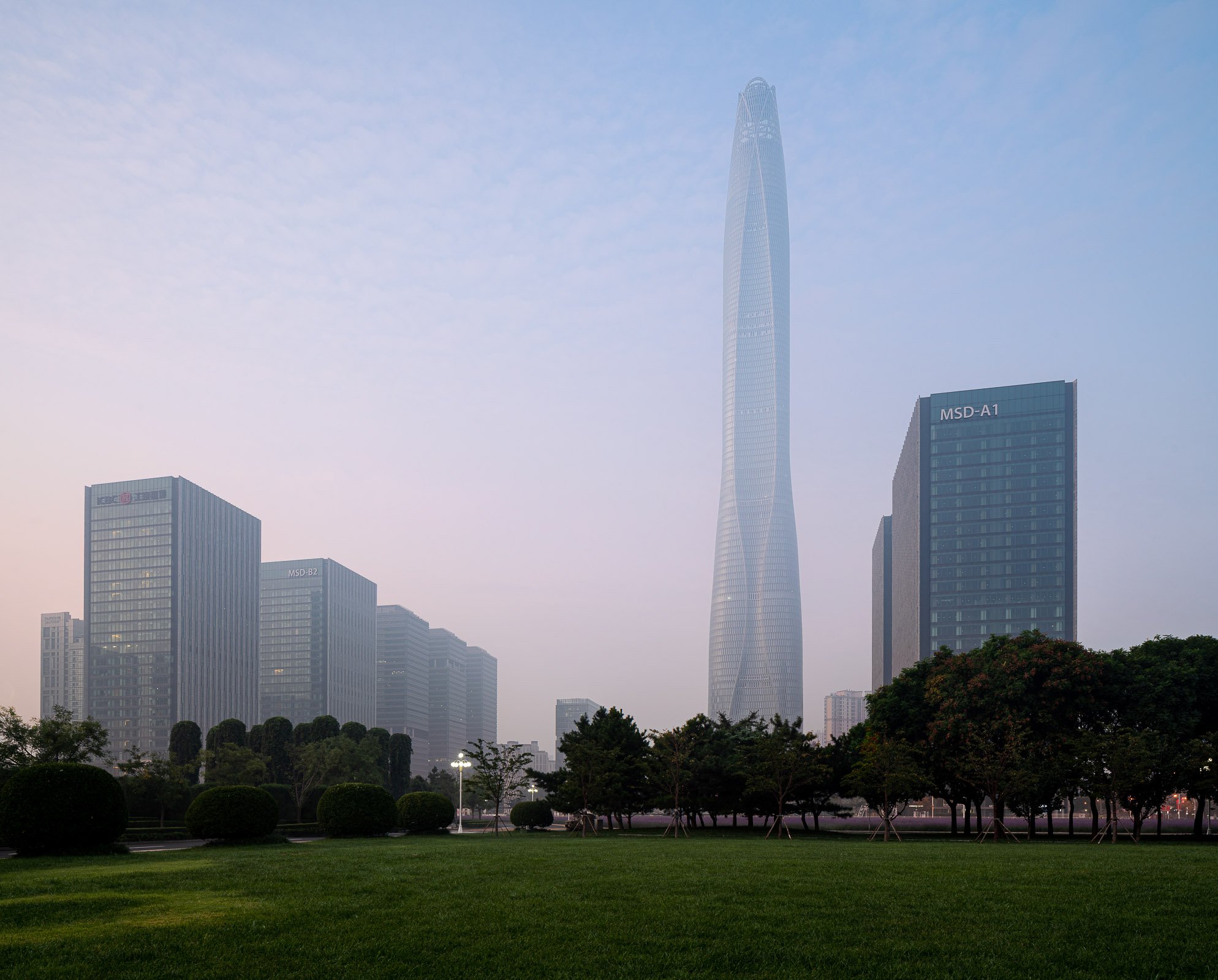
The Tianjin CTF Finance Centre is located in the Tianjin Economic-Technological Development Area (TEDA), an outer district of Tianjin, China. The design uses undulating curves to subtly express three programmatic elements while presenting a bold monolithic expression on the skyline. The 530-meter-tall skyscraper will house office space, luxury serviced apartments, and a hotel.
By stacking reducing floor plates, the tower tapers dramatically to minimize the surface area exposed to wind, sun, and moisture. The gently undulating curves of the façade subtly denote the integration of the three distinct programs within a singular smooth object. Square in plan with rounded corners, the floor plate geometry enables unique interior fit-outs and customization options for occupants. Research by the architect has shown that lateral forces due to vortex shedding can be controlled by tapering the vertical profile of the tower and softening any sharp corners in plan. The building’s aerodynamic shape greatly reduces this vortex shedding by “confusing the wind” and disrupting the opportunity for any resonating wind forces and loads on the structure.
The softly curving glass skin integrates eight sloping megacolumns that follow a lyrical line connecting the centers and corners of all four elevations. These curving megacolumns increase the structure’s response to seismic concerns and are integral to both the gravity and lateral systems. They are effective in increasing the stiffness of the building’s perimeter frame, consequently attracting a larger portion of the seismic forces in compliance with the Chinese code requirements.
The façade reinforces the curvature of the tower form and creates a shimmering texture over the building’s surface. The crystalline-like curtain wall stretches from the suspended glass canopies at each of the lobbies to the dematerialized, megacolumn-looped crown and presents a bold expression of a comprehensive, integrated design on the Tianjin skyline.
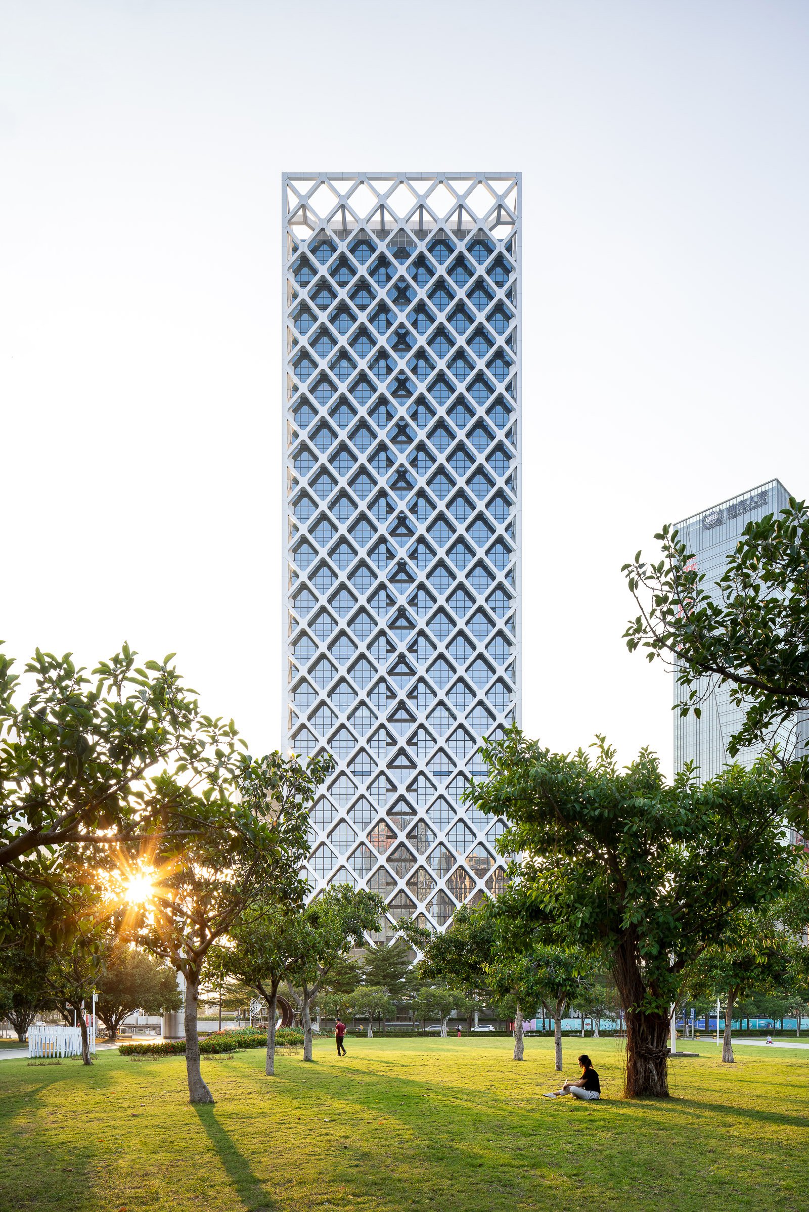
This new 150-meter-tall, mixed-use tower in Bao’an, Shenzhen, will be a world-class benchmark for sustainable design that uses naturally ventilated atria and a column-free external structure.
Vertical atria stretching the full height of the tower's east and west facades will provide ventilation and natural air circulation, improving the building's mechanical performance. Adjacent to a public park, and only three blocks from the sea, the tower will offer inhabitants spectacular views at every floor via the tall atria.
The structure will be an external steel diagrid, a symbol of SOM’s rich tradition of integrating architectural design and structural engineering. The diagrid will be pulled away from the facade, enabling flexible and column-free interior office space. It also will provide solar shading.
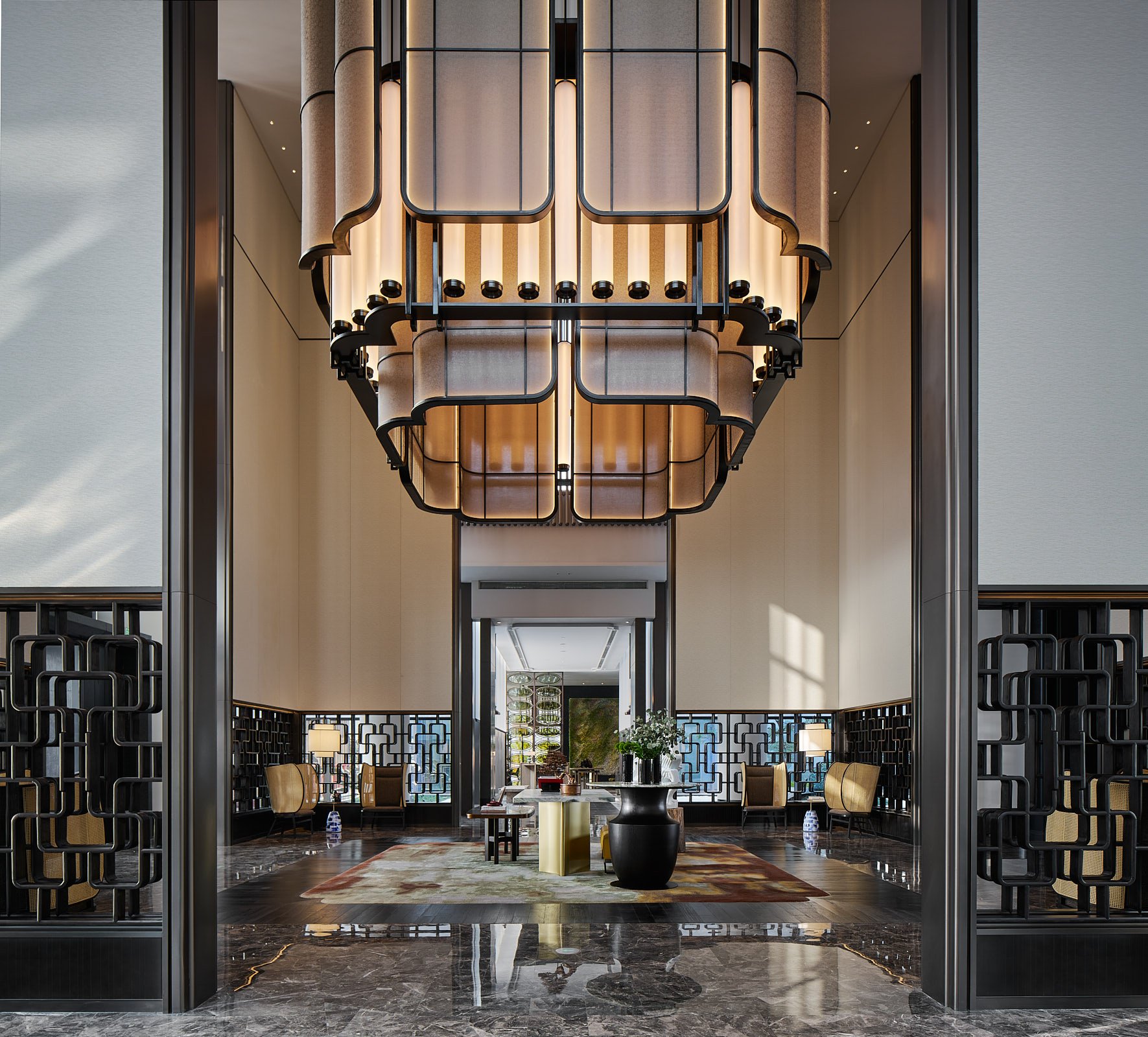
Nestled on a private island amidst the scenic Jinji Lake in Suzhou, renowned for its breathtaking gardens, Four Seasons Suzhou emerges as a seamless integration of outdoor and indoor spaces. Guests are invited to embark on an immersive journey through enchanting natural surroudings, starting from the island arrival and extending through vibrant social areas into luxurious accommodations.
Guided by the architectural principles of classical Chinese courtyards, Four Seasons Suzhou beautifully captures the essence of Suzhou culture through the integration of the Chinese architrave as a pervasive design element. Paying homage to the city’s rich cultural legacy and the botanical elegance of its gardens, the hotel meticulously preserves this essence within the overarching theme of “One step, one scene” (一步一景), where each step reveals a unique scene.
Four Seasons Suzhou’s design language skillfully marries the finest aspects of Suzhou, harmonizing elements of nature, culture, art, and architecture with a contemporary touch across its distinct spaces: Central Courtyard - Lobby Spaces; Urban Treasure - Function Venues; Retreat Escapes - Recreational Areas and Urban Oasis - Accommodations. These spaces blend cohesively, forming an Urban Sanctuary.
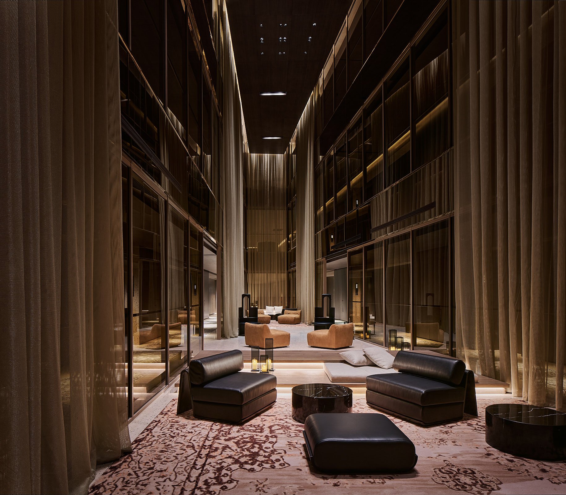
The dynamic city of Shanghai welcomes a groundbreaking addition to its vibrant tapestry with the grand unveiling of Kimpton Shanghai. Designed by the visionary Robbyn Carter, founder of Studio Carter, this newly inaugurated hotel promises to redefine hospitality by blending artistic innovation with community engagement.
Nestled in the heart of Shanghai, Kimpton Shanghai is not just a hotel; it's an immersive experience that beckons the creative community. Studio Carter's meticulous interior design has transformed the space into an open door that fosters connections among local creators, visionaries, and dreamers.
With an ethos of celebrating contrasts, the hotel bridges the gap between tradition and modernity, all while inviting guests to delve into the local creative pulse.
From arrival, Kimpton Shanghai envelops its guests in an unparalleled hospitality that encourages cultural exploration. The reception area doubles as a cultural curator, offering curated experiences that extend beyond its walls. Guests can delve into the local scene through specially crafted Kimpton playlists and a thoughtfully selected array of books.
The Discovery Bar, a unique welcome concept, empowers guests to personalize their stay by selecting amenity scents and teas that resonate with them. Kimpton Shanghai is replete with moments of discovery; hidden cabinets, private gardens, and exclusive reading nooks pepper the premises, providing havens for relaxation and inspiration.
A fusion of Shanghai's European influences and a futuristic interpretation of Shikumen architecture graces the hotel's design, paying homage to the city's heritage. The hotel's pièce de résistance is its Franco-Chinois-inspired brasserie, where contemporary Chinese flavors merge harmoniously with French culinary finesse. The dining area's atrium-inspired design seamlessly melds indoor and outdoor spaces, leading to a lush garden terrace boasting its chef's garden, a true embodiment of farm-to-table gastronomy.
As if curated by a symphony conductor, the bar, inspired by 18th-century French salons, orchestrates an intimate space that invites dialogue and serendipitous encounters. Live music, DJ sets, and spoken word performances foster an atmosphere of enlightenment, where local artists and cultural organizations find a platform to share their inspirations.
The guest rooms at Kimpton Shanghai exude an air of luxury and tranquility. A captivating stone hearth cradles a candle fireplace, inviting guests to unwind and recharge. Modern conveniences are seamlessly integrated into each room, with cleverly concealed mini-bars and a commitment to reducing plastic waste. Filtered water taps eliminate the need for disposable plastic bottles, underscoring Studio Carter's dedication to sustainability.
Bathrooms are reimagined as personal sanctuaries, with custom-made bathtubs and European timber-style floors that exude elegance. Kimpton Shanghai is a testament to Studio Carter's commitment to luxury and environmental responsibility, promising guests a space to rediscover and rekindle their connection with each stay.
Embark on a journey of discovery at Kimpton Shanghai, where every corner tells a story, and every visit unveils a new layer of creativity.
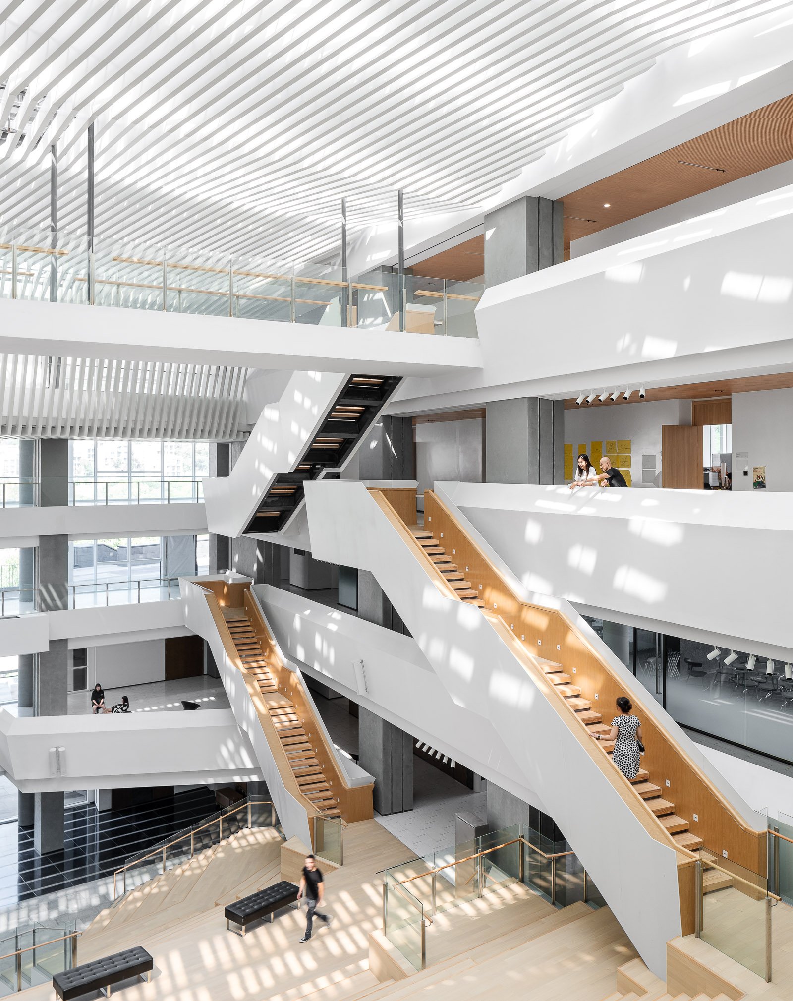
Designed by Moore Ruble Yudell (MRY), Ge Hekai is anchored by an 800-seat central forum at Wenzhou-Kean Univeristy. The building houses the university’s architecture, design, and computer science programs, is made to be occupied by students from around campus. The space features three stories of tiered seating overlooked by open balconies and an overhead bridge connecting the hall’s east and west wings.
The Wenzhou-Kean campus, a 175-acre site surrounded by mountains about an hour south of Shanghai, was created through a master plan by Michael Graves’s office that placed the university’s architecture and design schools (both named for Graves himself) at its center.
Eight oblong “bar” buildings, clad in Angola black granite, form the structure’s three-floor base, hosting community spaces and classrooms, flexible exhibition areas, a makerspace, a digital-media auditorium, and a lakeside café. Punched windows and deep inset ledges emphasize the three-foot thickness of the walls while also providing interior shading and hiding mechanicals and ductwork.
The bars are capped by two striking, daylit studio loft buildings, which form the fourth and fifth floors and offer more traditional architectural design studio spaces. These are fronted with ultra-high-performance concrete (UHPC) sunshades.
As the hall welcomes students from near and far, and from different disciplines across campus, it is on its way to achieving its potential as a campus gathering place and an incubator for the future. “This is a place for architecture, urban and industrial design, and computer science; by the time you put all those things together, you’re talking about the future fabric of society,” says Ruble.
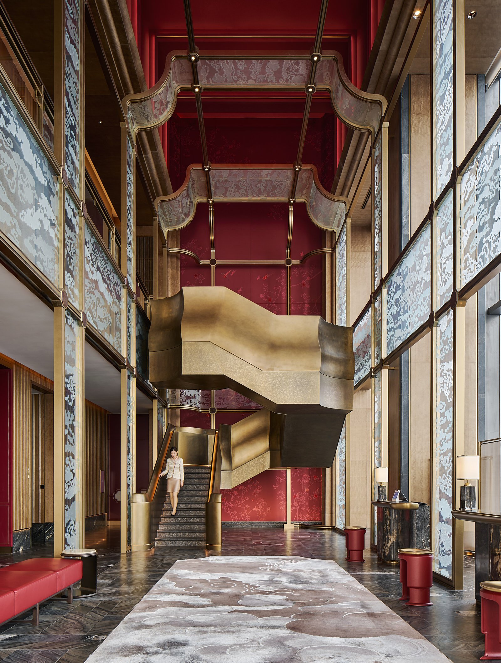
Emulating the Fushan Hill to the west and Laoshan Mountain to the east, Qingdao Financial City features a pair of iconic towers that create a new gateway for the city.
Qingdao Financial City is located centrally in the Qingdao Laoshan District and is an international, mixed-use development at the core of the Jinjialing new financial area. A high-value, regional and cultural landmark, the project consists of Class-A office space and luxury five-star hotels. Qingdao Financial City provides an urban center that balances modernity with timelessness and reinforces strong internal and external connections to the city. The project links directly to a large plaza south of the site, which offers a key gathering place and provides a venue where the client and tenants can host gatherings and festivals.
At 193-meters tall, each tower consists of five glass “jewel” boxes stacked vertically, symbolizing the prosperity of Jinjialing as a new financial center for the Northeast region of China. The glass boxes decrease in height as they ascend, forming a gradated, elegant silhouette. The shape of each box is chamfered at the corners to emphasize the prismatic nature. This design also reduces the wind loads on the tower, increasing their stability. Recessed mechanical floors sit between boxes, allowing for inconspicuous and efficient mechanical ventilation. At the base, a podium connects both towers through roof terraces, a grand ballroom, and dining spaces that sponsor an active mixed-use lifestyle.
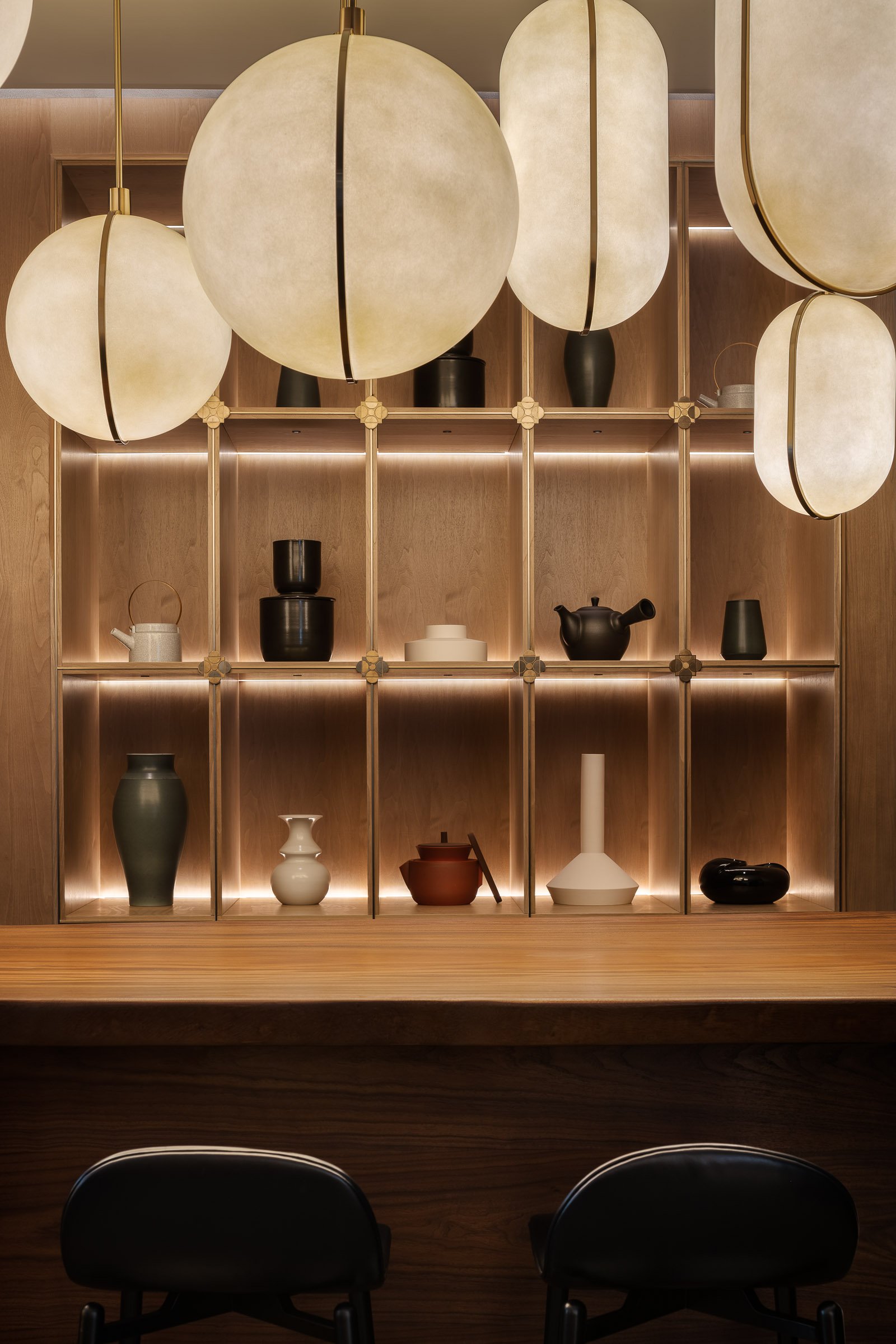
Hotel Indigo Hangzhou Uptown, situated in the picturesque West Lake scenic area, is more than just a hotel; it's a journey through time and culture. The design concept seamlessly weaves the intricate threads of history, art, and modern luxury, creating a space where ancient and contemporary cultures converge perfectly. The hotel captures the essence of the Song Dynasty's legacy while embracing the avant-garde aesthetics of the present day.
The hotel boasts 136 thoughtfully designed rooms and suites, each reflecting the elegant storytelling quality of the neighborhood. Two distinctive types of accommodation, the "Four Arts" of the Southern Song Dynasty and Lin'an Imperial City Night, offer guests an immersive experience in the captivating world of Song culture.
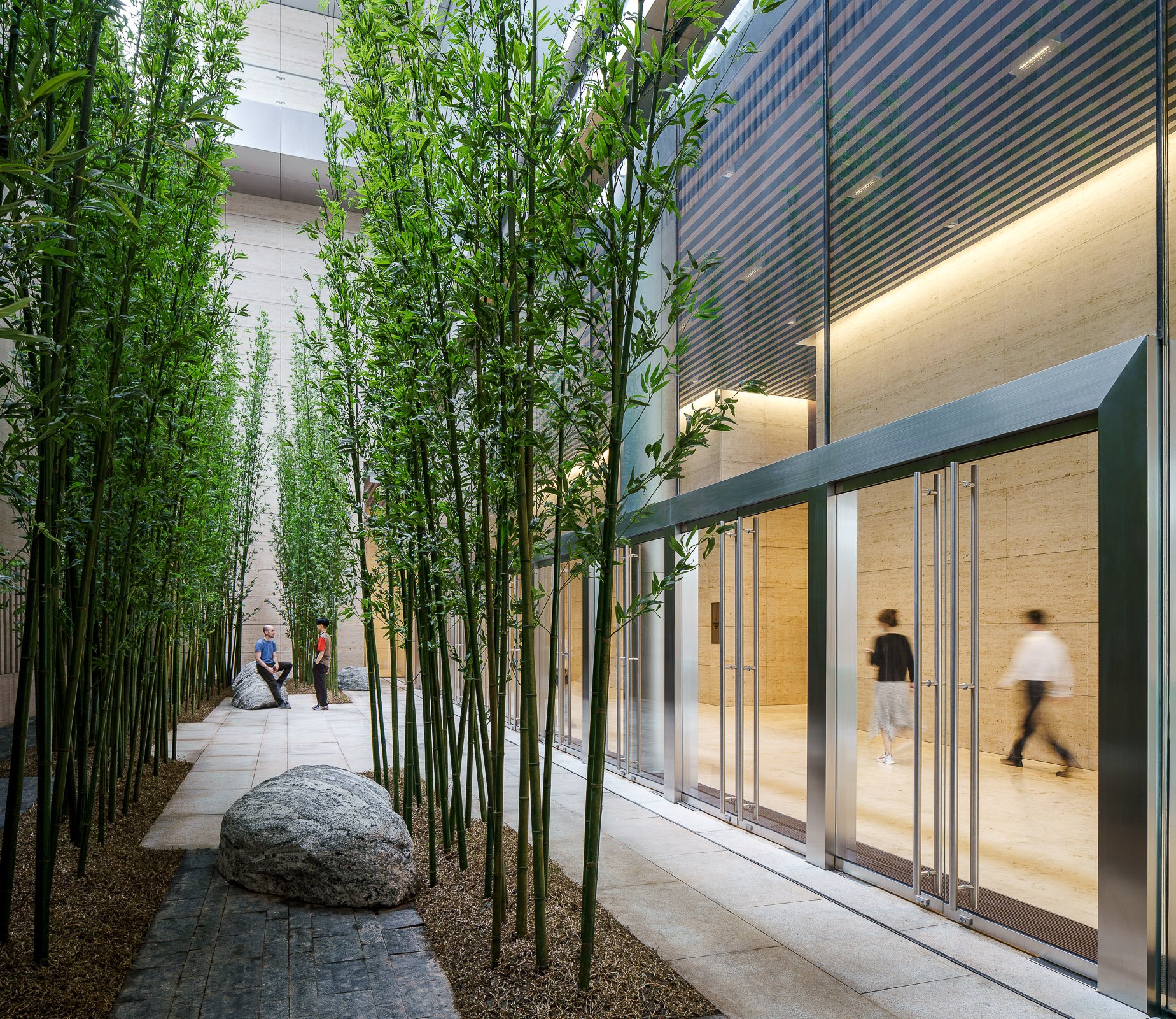
A new destination located just north of Shenzhen’s main central business district, this mixed-use development features two landmark towers, a ballroom pavilion, and a large elevated pedestrian park that connects the hills of the city’s two major parks: Lotus Hill Park to the southwest and Beacon Hill Park to the northeast. An enlivened podium provides a variety of retail experiences, including a large indoor mall and a small-scale shopping village.
Designed with an emphasis on elegance and simplicity, the towers are a timeless addition to the Shenzhen skyline. In order to provide world-class office spaces, the design incorporates flexible floor plates, highly efficient systems, and unobstructed city views—all features that greatly enhance the user experience.
SOM’s architecture and engineering teams collaborated on the design of both signature towers as well as the ballroom pavilion. The taller tower, rising 80 stories and 389 meters, contains office space in the lower floors and a luxury hotel at the top. It is supported by a central core and eight megacolumns at the perimeter, a structural solution which minimizes obstructions and opens up panoramic views. These qualities are further enhanced by the curtain wall design, which incorporates oversized glass on a 3-meter module throughout. The second tower, entirely dedicated to offices, features the same 3-meter curtain wall grid.
The ballroom pavilion features a unique outdoor public terrace that connects to the elevated public green. This 12.5-meter high open-air space frames views of Beacon Hill Park, which lies directly to the east of the pavilion. Two large ballrooms above this terrace offer panoramic views to both the east and west, and restaurants are located on the upper floor. The faceted design of the Pavilion resulted from a structural concept—the folded enclosure to the north, south, and on the roof provides a structural depth which enables the long spans for the ballroom spaces.
SOM also designed the two bridges that connect the site to the parks, which feature a meandering pathway to provide a varied experience along their length. The east bridge descends from the elevated green at a gentle slope, zig-zags across Huanggang Road to the east, and lands amid the tree-filled Beacon Hill Park. The west bridge, with its long spans across Caitian Road, is designed to provide a more protected pedestrian experience. The main pedestrian pathway weaves between successive garden spaces, while the depth of the bridge varies in correspondence with the long spans between columns.
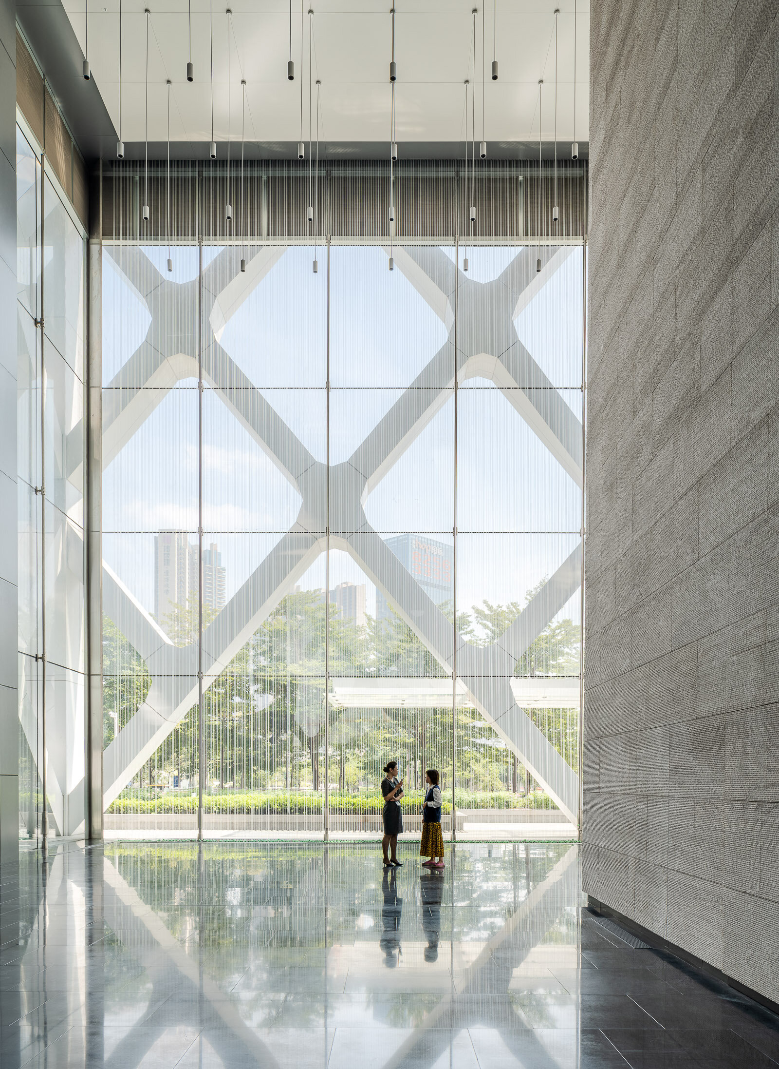
This new 150-meter-tall, mixed-use tower in Bao’an, Shenzhen, will be a world-class benchmark for sustainable design that uses naturally ventilated atria and a column-free external structure.
Vertical atria stretching the full height of the tower's east and west facades will provide ventilation and natural air circulation, improving the building's mechanical performance. Adjacent to a public park, and only three blocks from the sea, the tower will offer inhabitants spectacular views at every floor via the tall atria.
The structure will be an external steel diagrid, a symbol of SOM’s rich tradition of integrating architectural design and structural engineering. The diagrid will be pulled away from the facade, enabling flexible and column-free interior office space. It also will provide solar shading.
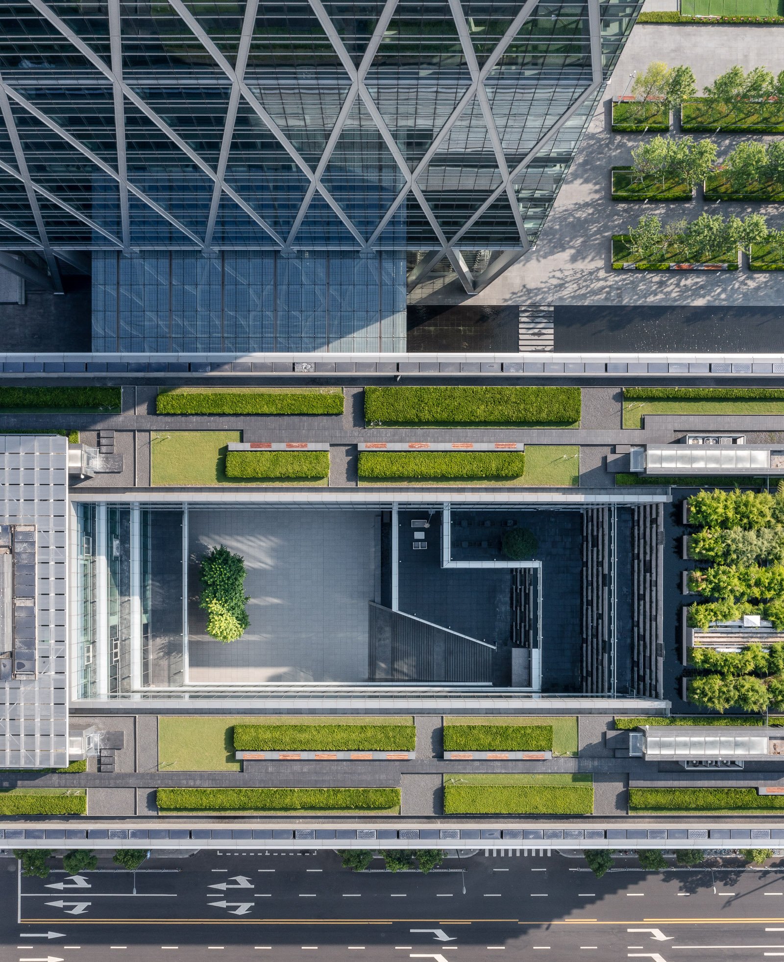
Guohua Financial Tower, a 45-story office high-rise and adjacent four-story mixed-use podium, is set to rise in Ningbo, China. As a model of simplicity, sustainability, and urban connectivity, the complex propels the evolution of a dynamic central business district in the port city.
Situated along a prominent east-west boulevard in East New Town, the site’s new public spaces are organized to draw tenants and visitors from all directions. A plaza features highly visible public art, and the low-rise building’s primary functional spaces are lifted to create an inviting open-air courtyard whose light-filled terraces, waterfalls, and serene reflecting pool demand attention. A spacious glass atrium directly connects the retail court to the office tower’s lobby, which enjoys an equally strong and welcoming 360-degree presence.
Guohua Financial Tower’s skyscraper is highly efficient in plan and execution. A visible steel-and-concrete diagrid creates a memorable diamond pattern for the facade; it also reduces structural stress on the building’s core, enabling it to occupy less space at the middle and upper floors and allowing office plans to be open and flexible throughout.
Underscoring the entire project’s commitment to sustainable workspace, the tower contains two multistory sky gardens. Here, natural and mechanical systems interact in an innovative fashion, as living walls provide natural filtration for the air circulating throughout the building. These vegetated surfaces also figure into a circuit that filters rainwater for irrigating landscaping and replenishing the plaza’s reflecting pool. The high-performance design of Guohua Financial Tower targets both LEED® Gold and China’s Three Star certifications.
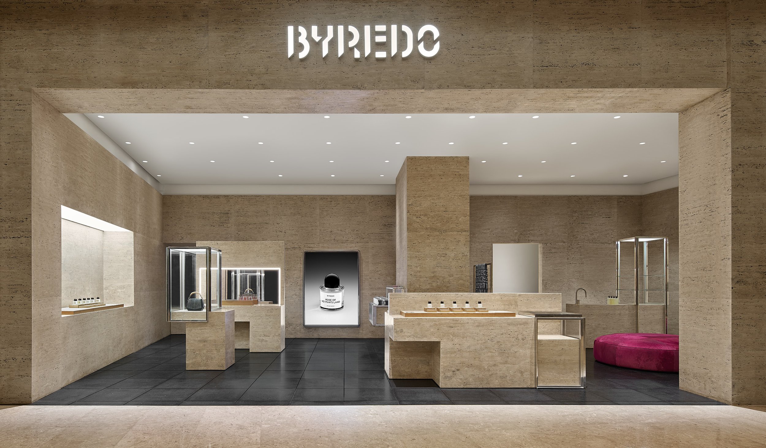
BYREDO opened the third location in Beijing in 2023. Located on the prosperous Wangfujing Street, WF CENTRAL is only a stone's throw away from the Forbidden City and the Central Business District of Beijing.
BYREDO北京王府中环旗舰店盛大启幕
“在北京,各个区域各有千秋,我总是被北京这座城市的规模和能量所震撼。对于BYREDO而言,走进客人所在的地方并与之发生联结,基于各地的特色去展现我们多元的面貌,这才是至关重要的。“ ——BYREDO创始人兼创意总监Ben Gorham。
全新王府中环旗舰店采用简雅单色,于大地米色调中呈现前卫的视觉表达,同时延续品牌对材质的坚持,以罗马洞石完整覆盖门头及内壁,填缝黑色树脂,凸显极富冲击力的现代美学。
手工铺设的黑色镶嵌款水磨石地板,与工业风格的铝框玻璃橱窗和灯箱等实用主义元素并置,构成精妙的美学张力。纯粹极简的空间内,点缀着色调明亮的家具,充分彰显了BYREDO所构想的当代奢华。
全新BYREDO北京王府中环旗舰店将呈献品牌全线作品,包括经典香氛、家居香氛、先锋美妆、身体及手部护理产品,以及Byproduct系列精选产品。
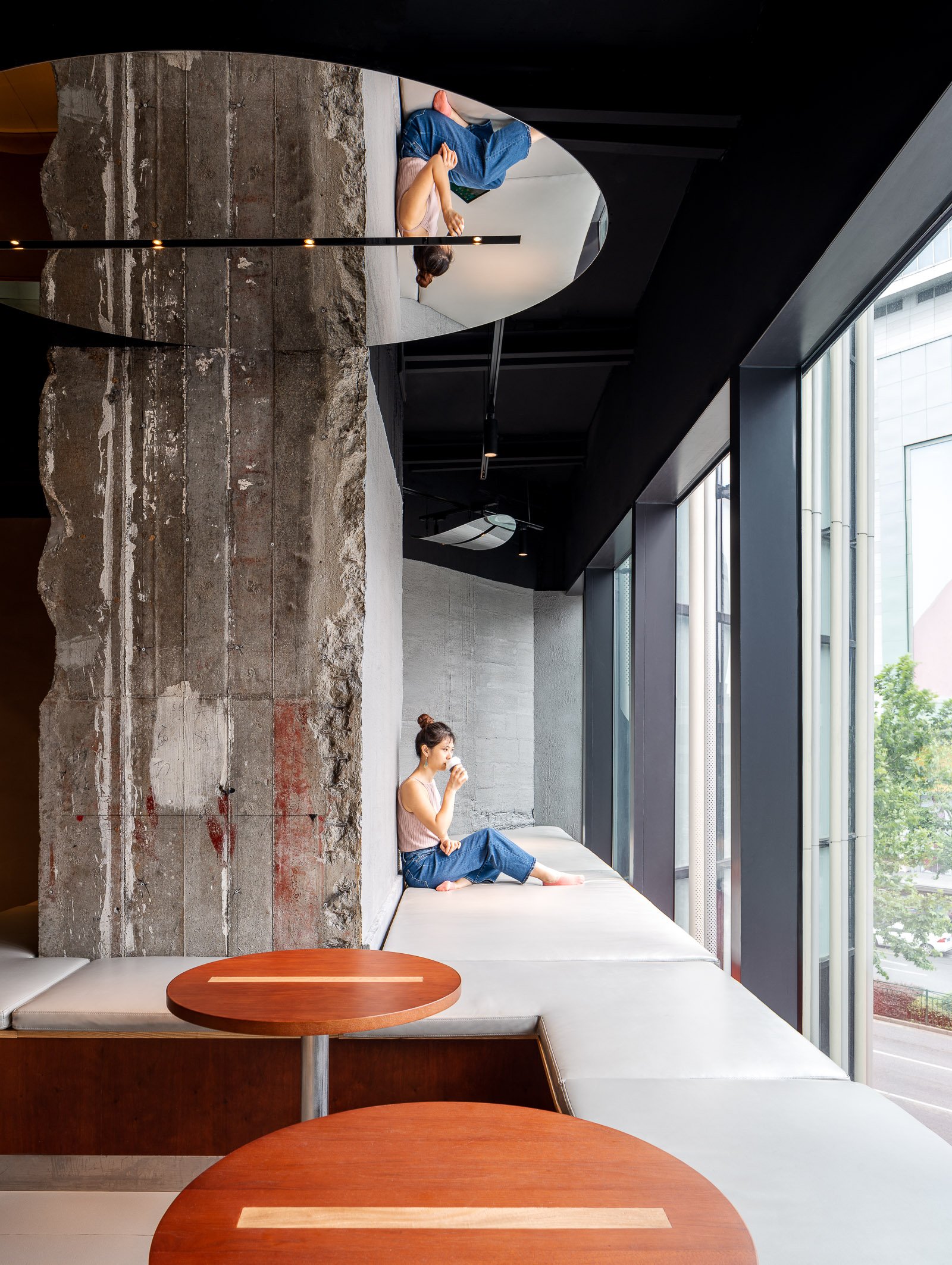
SeeSaw Coffee, a homegrown Shanghai brand, opened a new location in the recently renovated Huarun Times Square in Pudong, Shanghai. The shopping mall stands at a very busy intersection and with Starbucks Reserve located on the first floor, it was pertinent for SeeSaw to maintain its originality. The designer TAKESHI HOSAKA architects focused on featuring coffee beans native to China in the design concept and aimed to provide a cozy and friendly atmosphere for their young clientele.
Stainless steel mirrors shaped like coffee beans hang from the ceiling throughout the store. The bustling intersection of cars, bikes and people outside are drawn into the store through the mirrors, invoking an urban atmosphere. The mirrors also reflect the appearance of baristas working inside the store. The youthful and vibrant interior contrasts with the dim lighting, creating a unique atmosphere.
The designer gave serious consideration to creating a relaxing setting for drinking coffee, since the fixed glass facade on the third floor could easily give a closed-off and stagnant feeling to the space. Shanghai is known to be a bustling city with lots of foot, bicycle and car traffic, so the designer took advantage of the “moving” city and incorporated the “floating coffee bean” mirrors to reflect not only the exterior views but also the daily scenes of people, bicycles and cars constantly moving. These reflections also give people a fresh perspective on the urban scenery that they are familiar with.
The mirrors take on a variety of different shapes and sizes, depending on where the customer sits. The shape of the coffee bean mirrors have also been carefully considered. The coffee beans are shaped like the number "0", with a "1" in the center. In the binary world, "0" and "1" can generate unlimited information. The designer uses ones and zeros to represent SeeSaw’s changing collection of fresh coffee beans from around the world, and the brand’s openness and willingness to take on changes and challenges.
At dusk, coffee beans emerge from the dimly lit store, captivating the interest of people waiting for traffic at the intersection outside of the mall. The middle of the space can be easily converted into a meeting space, perfect for hosting events. There are also spaces behind the pillars where customers can take off their shoes, relax and enjoy the view of the city through the floor-to-ceiling windows.
TAKESHI HOSAKA architects has successfully created a relaxing space that brings the urban scenery into a shopping mall, while showcasing SeeSaw’s efforts in helping China’s domestic coffee bean industry grow and prosper.
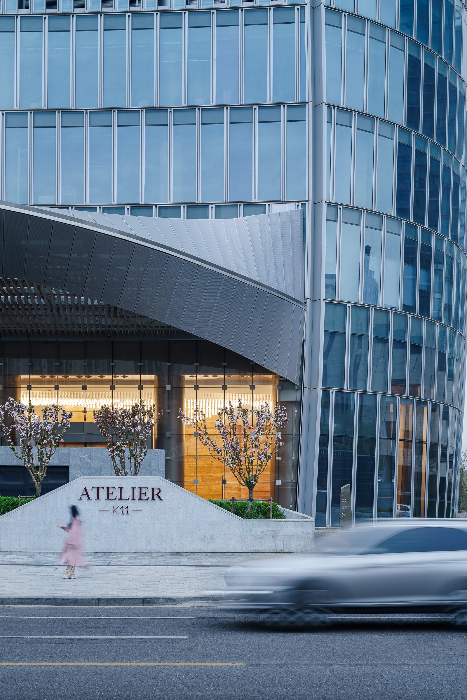
The Tianjin CTF Finance Centre is located in the Tianjin Economic-Technological Development Area (TEDA), an outer district of Tianjin, China. The design uses undulating curves to subtly express three programmatic elements while presenting a bold monolithic expression on the skyline. The 530-meter-tall skyscraper will house office space, luxury serviced apartments, and a hotel.
By stacking reducing floor plates, the tower tapers dramatically to minimize the surface area exposed to wind, sun, and moisture. The gently undulating curves of the façade subtly denote the integration of the three distinct programs within a singular smooth object. Square in plan with rounded corners, the floor plate geometry enables unique interior fit-outs and customization options for occupants. Research by the architect has shown that lateral forces due to vortex shedding can be controlled by tapering the vertical profile of the tower and softening any sharp corners in plan. The building’s aerodynamic shape greatly reduces this vortex shedding by “confusing the wind” and disrupting the opportunity for any resonating wind forces and loads on the structure.
The softly curving glass skin integrates eight sloping megacolumns that follow a lyrical line connecting the centers and corners of all four elevations. These curving megacolumns increase the structure’s response to seismic concerns and are integral to both the gravity and lateral systems. They are effective in increasing the stiffness of the building’s perimeter frame, consequently attracting a larger portion of the seismic forces in compliance with the Chinese code requirements.
The façade reinforces the curvature of the tower form and creates a shimmering texture over the building’s surface. The crystalline-like curtain wall stretches from the suspended glass canopies at each of the lobbies to the dematerialized, megacolumn-looped crown and presents a bold expression of a comprehensive, integrated design on the Tianjin skyline.
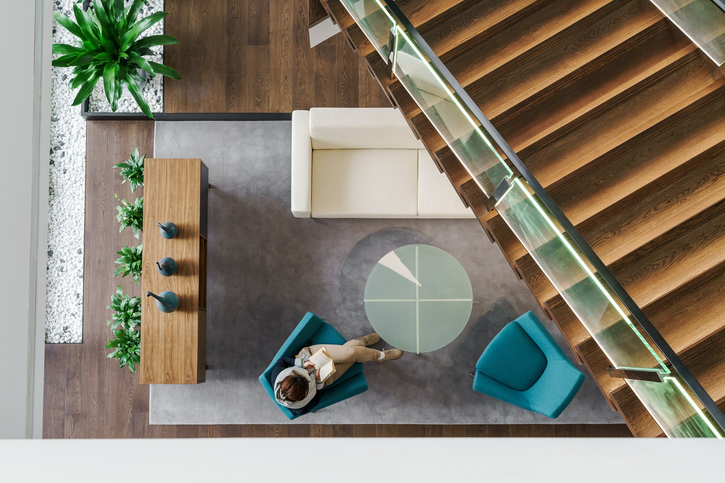
The Abbott Customer Experience Center (CEC) will foster a customer focused show-suite and training center with state-of-the-art interactive technology. In lieu of a traditional reception desk, the lobby welcomes visitors with a two-story modular digital LED tile wall, surrounding speakers, a hanging art-sculpture with customer-engaging audio-visual hardware, and a cantilevered continuous staircase the spans the entire vertical stretch of the building. We designed in a 50-person auditorium, executive business center, an exterior roof terrace, garden, staff workplace, call center, and fully functioning biosafety training labs.
Achieving a rating of LEED Silver, this facility represents the company’s commitment to sustainability, wellness, and a human-centered purpose to healthcare science.
Founded on the belief that all design should deliver a human connection with space, we begin our process with a deep-dive exploration of what emotional reactions would align with core business objectives. If the desired effect is comfort, excitement, playful, cheerful, confidence, boldness, intimacy, or even an uncomfortable awkwardness, this informs specific properties of scale, materiality, colors, spatial adjacencies, lighting and furniture selections.
The Abbott CEC is designed with the human experience in mind first — driving the technology integration, user interface, materials, and the interior architecture.
During the 6-month design period, a carefully constructed customer journey was mapped out through working intimately with Abbott and consultants to gain a deep understanding of their business. The journey outlined the experiences and interface for the users (customers) at each “touch point”. This then informed the architectural design of the space.
The 6 x 8 x 2.4h meter “Möbius strip” or “Infinite Ribbon” sculpture was created as an iconic arrival point for customers in the lobby, to inspire curiosity and push information about Abbott. The structure is completely hung from the ceiling and cantilevered from the core wall. Guests can walk inside and thru motion sensors, the LED display screens and background audio immediately come alive. Videos are played on screens on both sides. Gesture-based menu interaction is also available for a more customized experience.
The stair is at the heart of connectivity between floor functions and the vertical journey experience. Guests walk up the stair with an obscure view up thru “floating” landings to the fourth floor. New slab openings, structural bracing, and each stair run and landing is fully cantilevered from the building core, with only 1 larger support at the base. The first 3 steps of the stair were created as landings to hide this support.
The Customer Experience Center begins on the second floor. The “Hall of Challenges” disrupts guests perception of space through a long corridor with light in motion, reflection, intense sound effects, and digital images on screen beyond. This experience was designed to disconnect customers from their previous surroundings and into a fully immersive new space which begged for their attention.
The other rooms of the Experience Center include a curved floor-to-ceiling rear projection screen, dramatic surround sound, 48-point ‘Multitaction’ touch screen, ceiling light effects, a virtual environment with rear projection on all four walls of the room (where any environment could be presented), product demo area, and an interactive customer solution room.
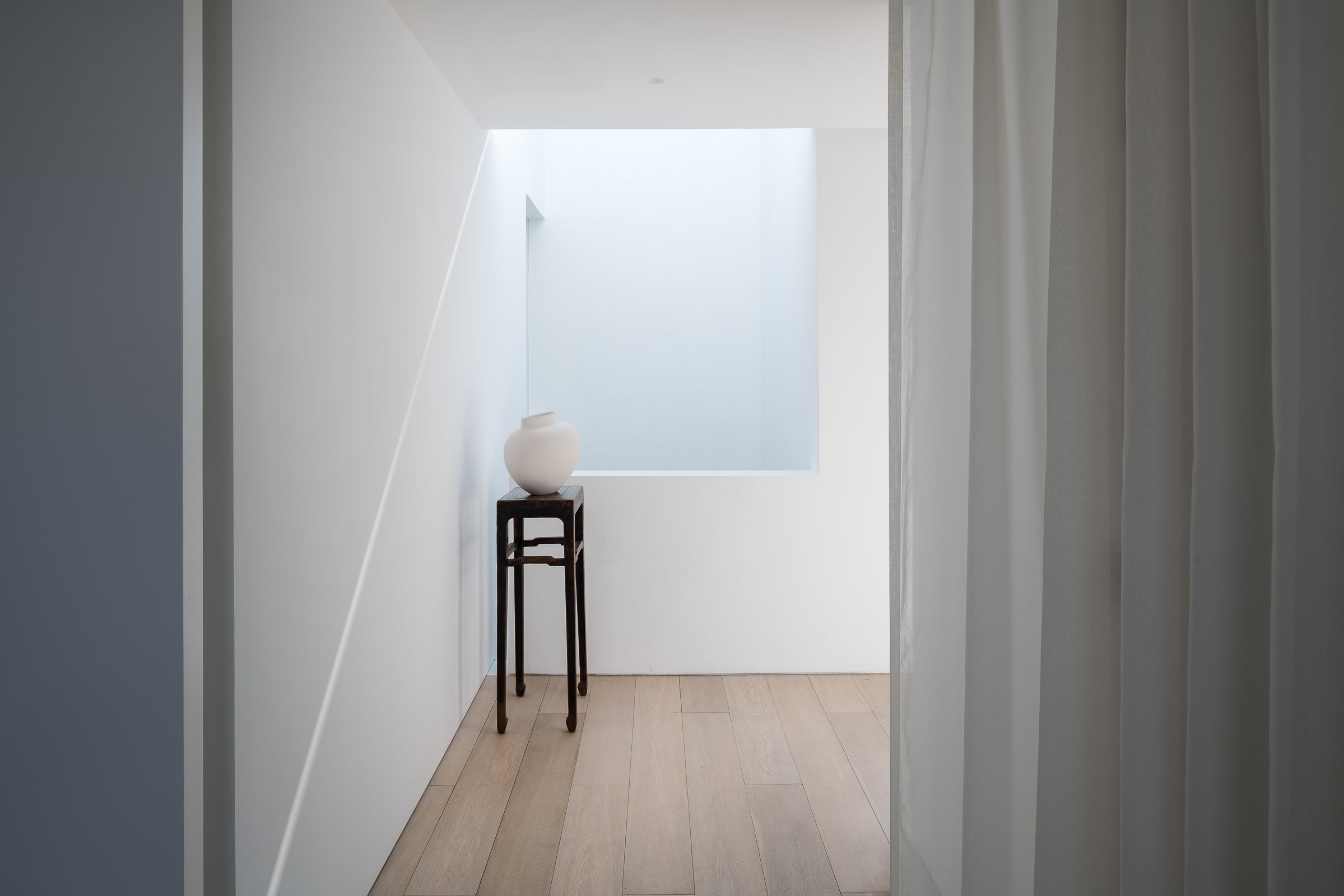
The interior space was designed by Shanghai-based design practice Neri & Hu.
A villa designed by Neri & Hu in THE VILLAGE, a community of life learners in Sangha. Sangha Retreat by Octave is a life learning and wellness community on the shores of beautiful Yangcheng Lake, Suzhou. Sangha seeks to re-establish the connection and unity between people and the inner self, others, and nature. One of the best and largest of wellness centers in China, it offers an eclectic selection of premium lifelong learning and wellness programs, ranging from wellness spa packages to fully-serviced hotels and lakeside villas, with custom medical evaluation and services, body training, early education and a gourmet restaurant as part of the experience.
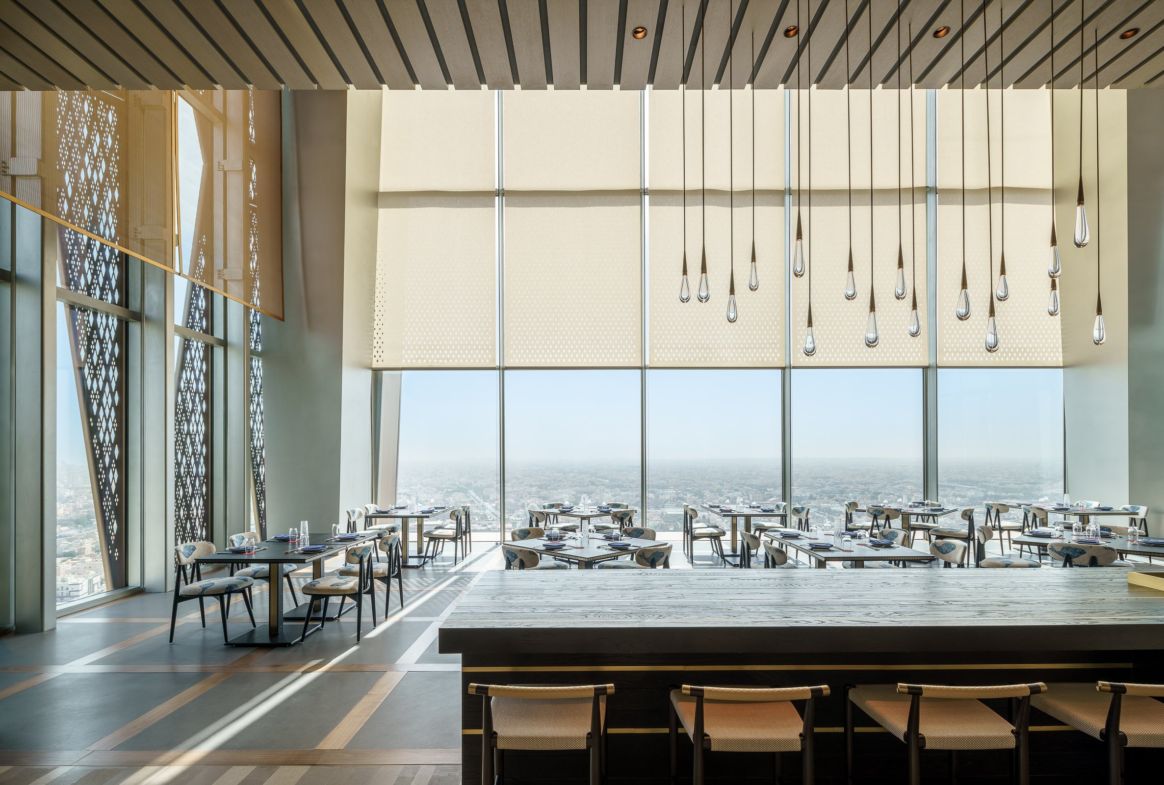
Kokaistudios' newest projects with Four Seasons Hotels & Resorts - the Sintoho Asian fine dining restaurant located on the top floor of the newly built Four Seasons Kuwait in the Burj Alshaya building. Having previously worked together on the Brasserie at the Four Seasons Kyoto the Four Seasons team invited Kokaistudios to conceive an innovative F&B destination that could elevate the street foods of the cities of Singapore, Tokyo and Hong Kong into a fine dining destination and experience.
Intrigued by the concept and the location in a city with no established tradition of Asian fine dining we set about creating a temple to Asian cuisine and craftsmanship that eschewed kitschy and thematic styles and aimed for the creation of an essential and refreshing space in which the dining experience is influenced both by the architecture of the space and the food offering.
The restaurant design was conceived first and foremost around the idea of celebrating the diversity and excellence of Asian cuisine and creating spaces and opportunities for the guests to experience the sights, smells and tastes of these food cultures up close.
We searched for commonalities between the cultures in order to come up with a design language to unite them and we took our inspiration less from the current nature of the individual countries but rather from the historical role that Chinese culture has played over time throughout Asia and how those influences continue to be part of everyday life.
The entrance area of the restaurant features a long corridor flanked on one side by an expansive green wall filled primarily with local desert plant varietals and on the other by a series of custom designed water towers which combine to create a cooling and soothing experience. The corridor finishes in a tea wall fronted by an elaborate carved wood tea station where guests can select an expansive choice of fine teas.
To the right of the entrance corridor sits the main open dining area on the right that features expansive 12 meter high ceilings that offers expansive views of the city and the Persian Gulf beyond. The front dining area center features a series of custom designed furniture for which we cooperated with Kyoto based artisans and the area is hemmed by an extensive shousugi ban burnt wood sushi counter inlaid with hand hammered brass. The soft lighting in the area comes from the series of water drop glass pendants produced by the London based artisans DHLiberty Lux.
The rest of the public area seating is centered largely around the individual open live cooking stations where guests can experience up-close the preparation of robatta, teppanyaki, and dim sum and other delicacies from Hong Kong which have been clad by hand-hammered metal hoods and sculpted stone bases featuring images and motifs typical inspired by classical designs found in China.
The strong inter-play between the main materials of wood, stone, and hand-finished metals is thrown a curve by the insertion of a 3D feature wall made of exposed concrete forms that runs the length of the kitchen wall and has been designed using parametric principles and its undulating form appears as a dynamic wave while being in actuality a straight structure.
The private dining rooms are an ode to Chinese embroidery craftsmanship with bespoke chairs and walls featuring hand-printed linen fabric albeit with a wink to principal designer Filippo Gabbiani’s home town of Venice via the use of the Fortuny silk pendant lamps and red Murano glass inlays. The bathrooms are an experience in and of themselves as we cooperated with a Shanghai based video production team Flatmind to create a series of Chinese shadow video installations that are projected on the grey hand hammered Chinese stone.
The outdoor seating areas that are shared with the neighboring Italian restaurant Dai Forni; also designed by Kokaistudios; feature a stunning glass sculpture from London based artisans Duffy. The design of this project is a new step in Kokaistudios method of combining a strong architectural approach to the design of interiors with an original use of materials and light to create unexpected subtle emphatic feeling between the space and the people; handcrafted materials shaped and controlled up to the finest detail interact and interplay with the both the day and night light and reveal an incredibly expressive power.
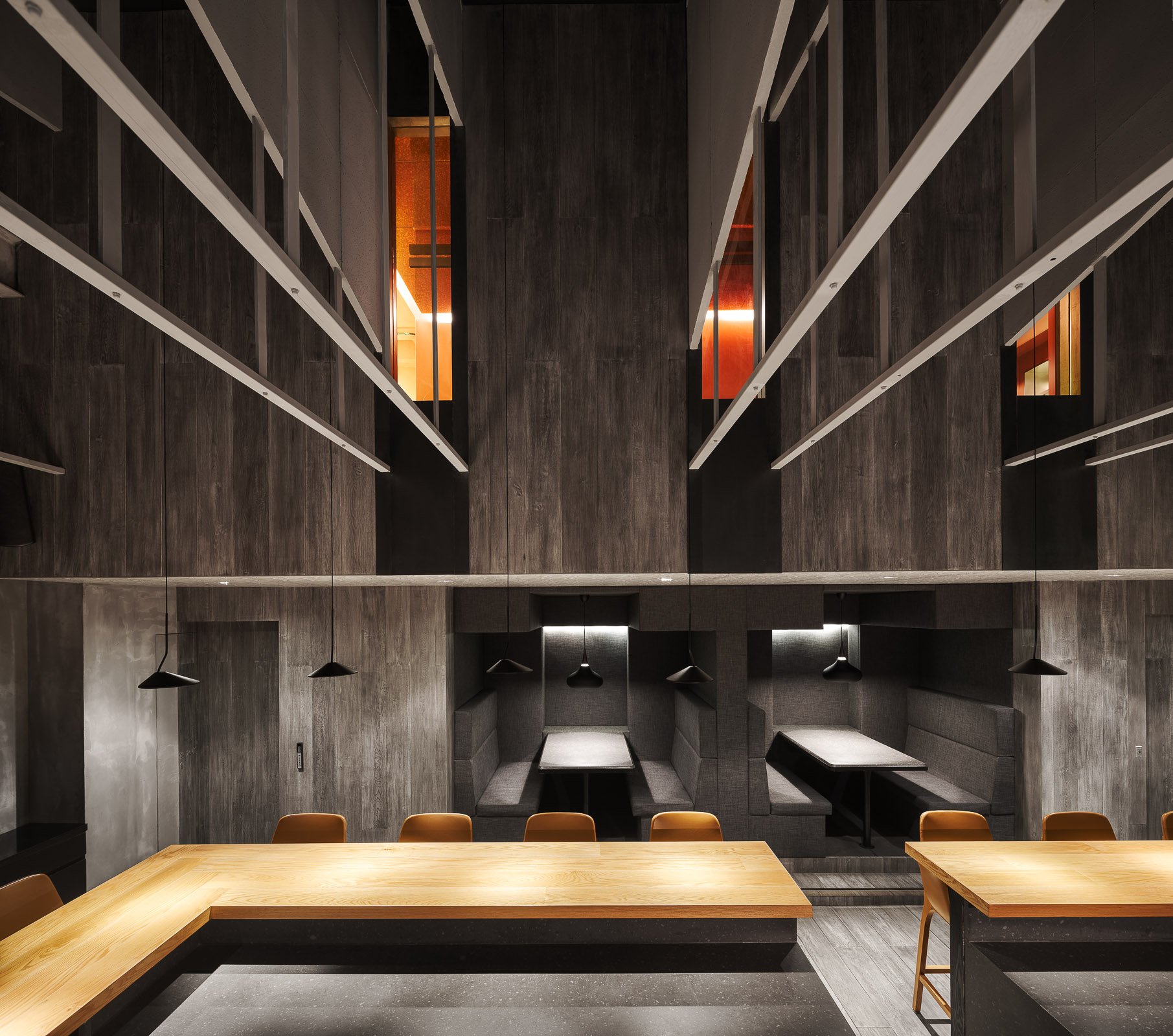
Hidden in a deep lane in Shanghai, the Michelin-starred restaurant Taian Table is a small and intimate dining destination with an open kitchen and an ethos that based itself of a single, seasonal tasting menu. In 2017, it relocated to the current venue. Interior design by Shanghai-based architecture and design firm, A00.
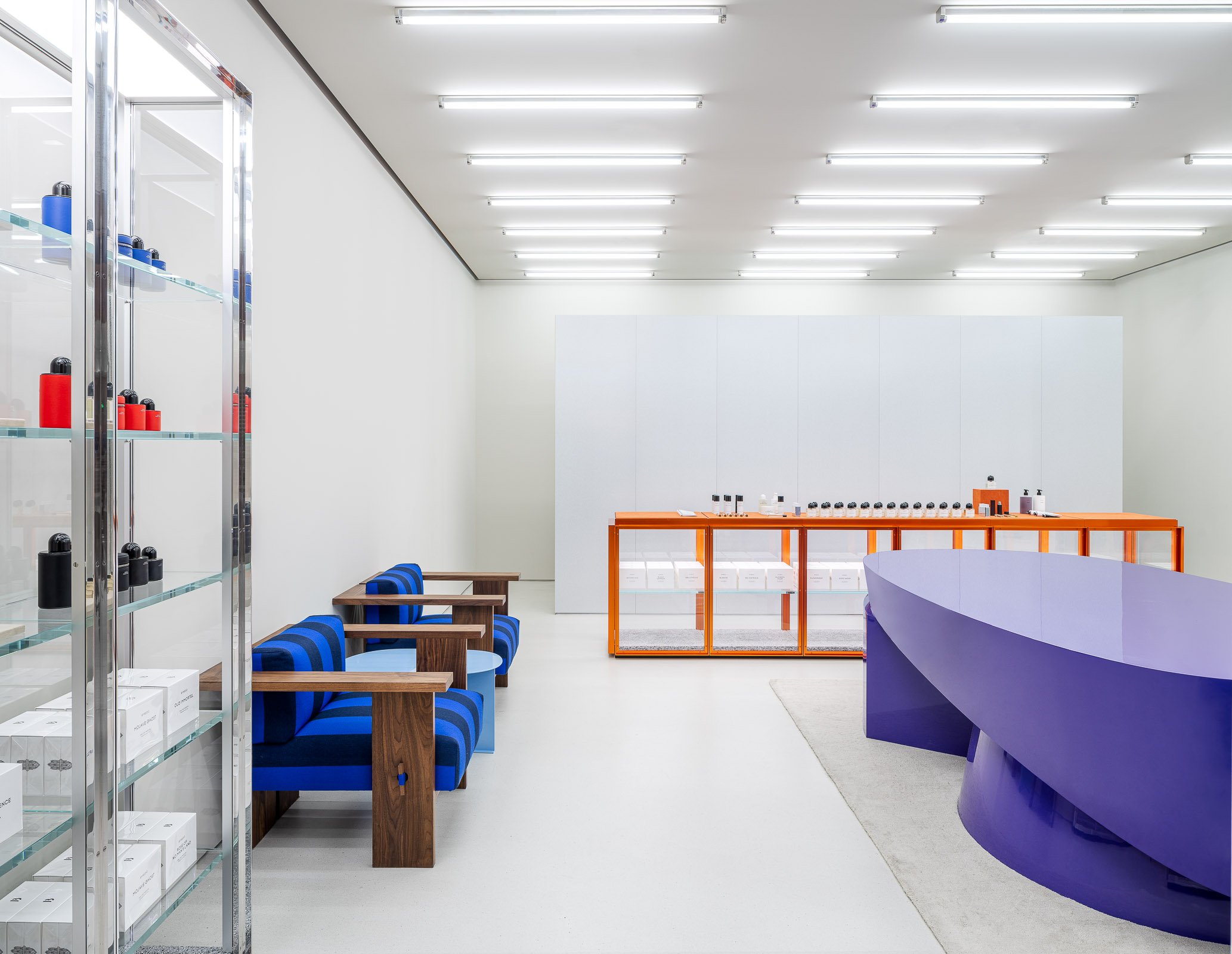
The new store is part of a series of openings across China, and is indicative of the city’s rise as a shopping destination, and one as forward in offerings as fellow first-tier cities Shanghai, Beijing and Guangzhou. Situated at The MixC shopping mall in the city’s Nanshan district, the store occupies a compact unit featuring an interior design by Stockholm-based architect and longtime collaborator Christian Halleröd. A hydraulic crane trolley lifting a colourful light box signals the store’s presence. Walls, flooring and ceiling in a soft grey hue form the backdrop for an assortment of furnishings, including large glass and steel cabinets, similar low cabinets with an orange frame, chunky wooden sofas with blue-striped upholstery, and a large oval table dipped in a striking purple hue. One side of the store is lined with large mirrors and pink stools. Lighting is highly functional, and sees three rows of tubular lights across the ceiling. The new Byredo store carries the brand’s full range of perfumes, home fragrances and hand & body care products.
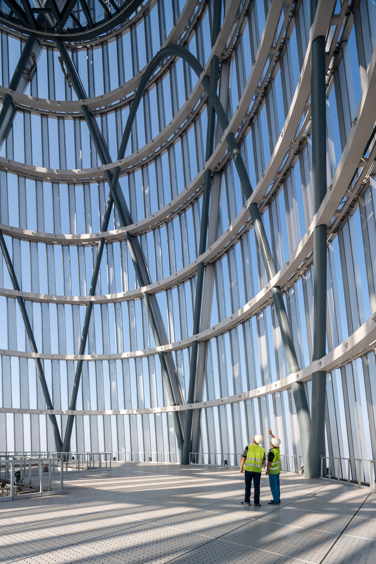
The Tianjin CTF Finance Centre is located in the Tianjin Economic-Technological Development Area (TEDA), an outer district of Tianjin, China. The design uses undulating curves to subtly express three programmatic elements while presenting a bold monolithic expression on the skyline. The 530-meter-tall skyscraper will house office space, luxury serviced apartments, and a hotel.
By stacking reducing floor plates, the tower tapers dramatically to minimize the surface area exposed to wind, sun, and moisture. The gently undulating curves of the façade subtly denote the integration of the three distinct programs within a singular smooth object. Square in plan with rounded corners, the floor plate geometry enables unique interior fit-outs and customization options for occupants. Research by the architect has shown that lateral forces due to vortex shedding can be controlled by tapering the vertical profile of the tower and softening any sharp corners in plan. The building’s aerodynamic shape greatly reduces this vortex shedding by “confusing the wind” and disrupting the opportunity for any resonating wind forces and loads on the structure.
The softly curving glass skin integrates eight sloping megacolumns that follow a lyrical line connecting the centers and corners of all four elevations. These curving megacolumns increase the structure’s response to seismic concerns and are integral to both the gravity and lateral systems. They are effective in increasing the stiffness of the building’s perimeter frame, consequently attracting a larger portion of the seismic forces in compliance with the Chinese code requirements.
The façade reinforces the curvature of the tower form and creates a shimmering texture over the building’s surface. The crystalline-like curtain wall stretches from the suspended glass canopies at each of the lobbies to the dematerialized, megacolumn-looped crown and presents a bold expression of a comprehensive, integrated design on the Tianjin skyline.
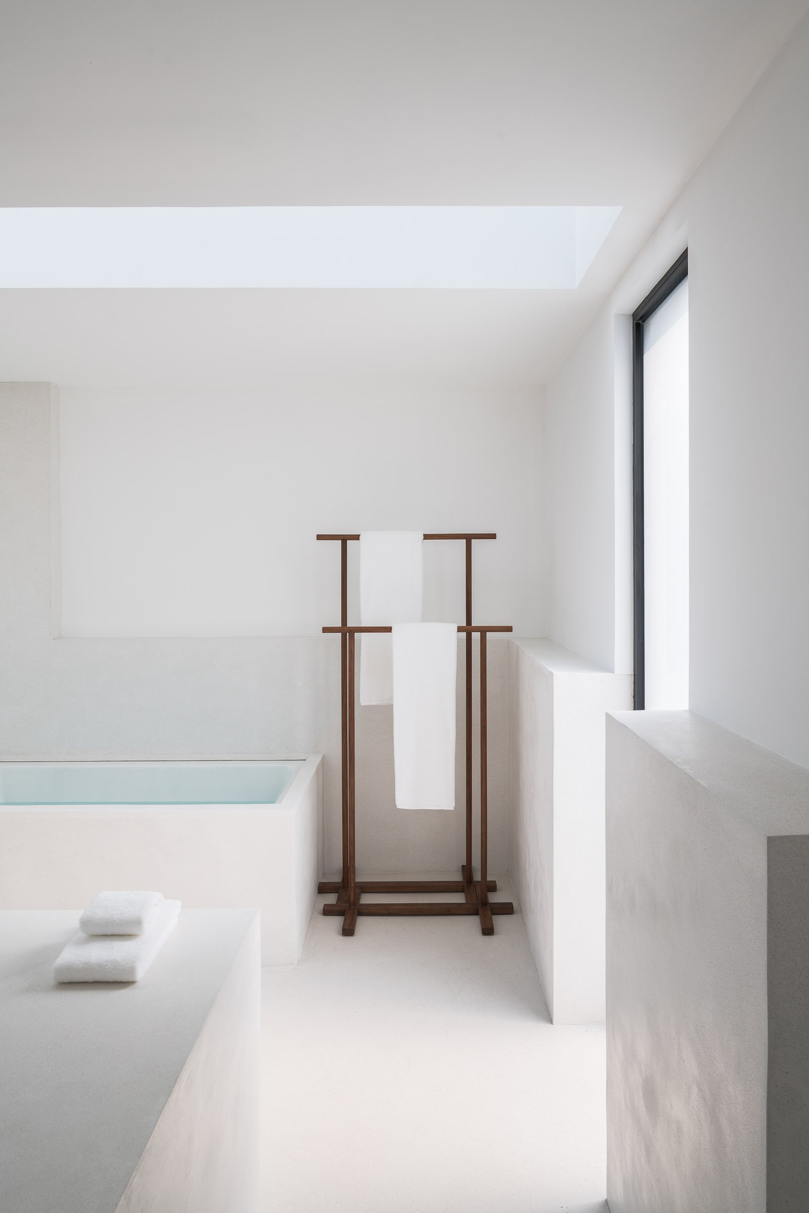
The interior space was designed by Shanghai-based design practice Neri & Hu.
A villa designed by Neri & Hu in THE VILLAGE, a community of life learners in Sangha. Sangha Retreat by Octave is a life learning and wellness community on the shores of beautiful Yangcheng Lake, Suzhou. Sangha seeks to re-establish the connection and unity between people and the inner self, others, and nature. One of the best and largest of wellness centers in China, it offers an eclectic selection of premium lifelong learning and wellness programs, ranging from wellness spa packages to fully-serviced hotels and lakeside villas, with custom medical evaluation and services, body training, early education and a gourmet restaurant as part of the experience.
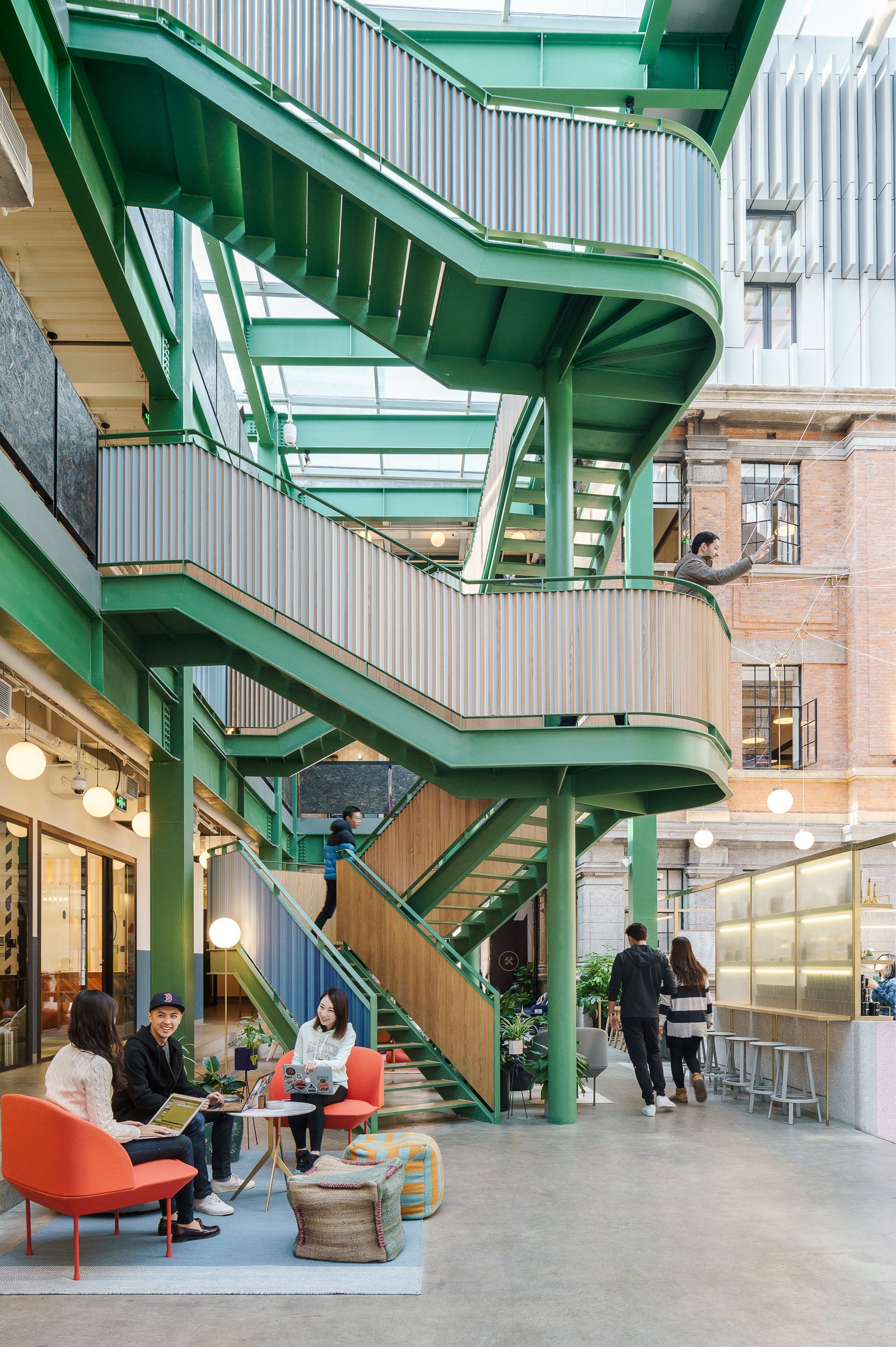
Headquartered in New-York with 50 office locations around the world, WeWork has now transformed Shanghai buildings into exciting shared workspaces.
As the flagship location for China, WeWork Weihai Road resides in a historical building originally designed by British firm Spence Robinson & Partners in the 1930s. The designer took inspiration from "The Grand Budapest Hotel" and added pink, blue and green into the original structure, combining lively modern design into the historical architecture.
The historic building has now transformed into a modern workspace, attracting aspiring entrepreneurs, designers and emerging businesses large and small.
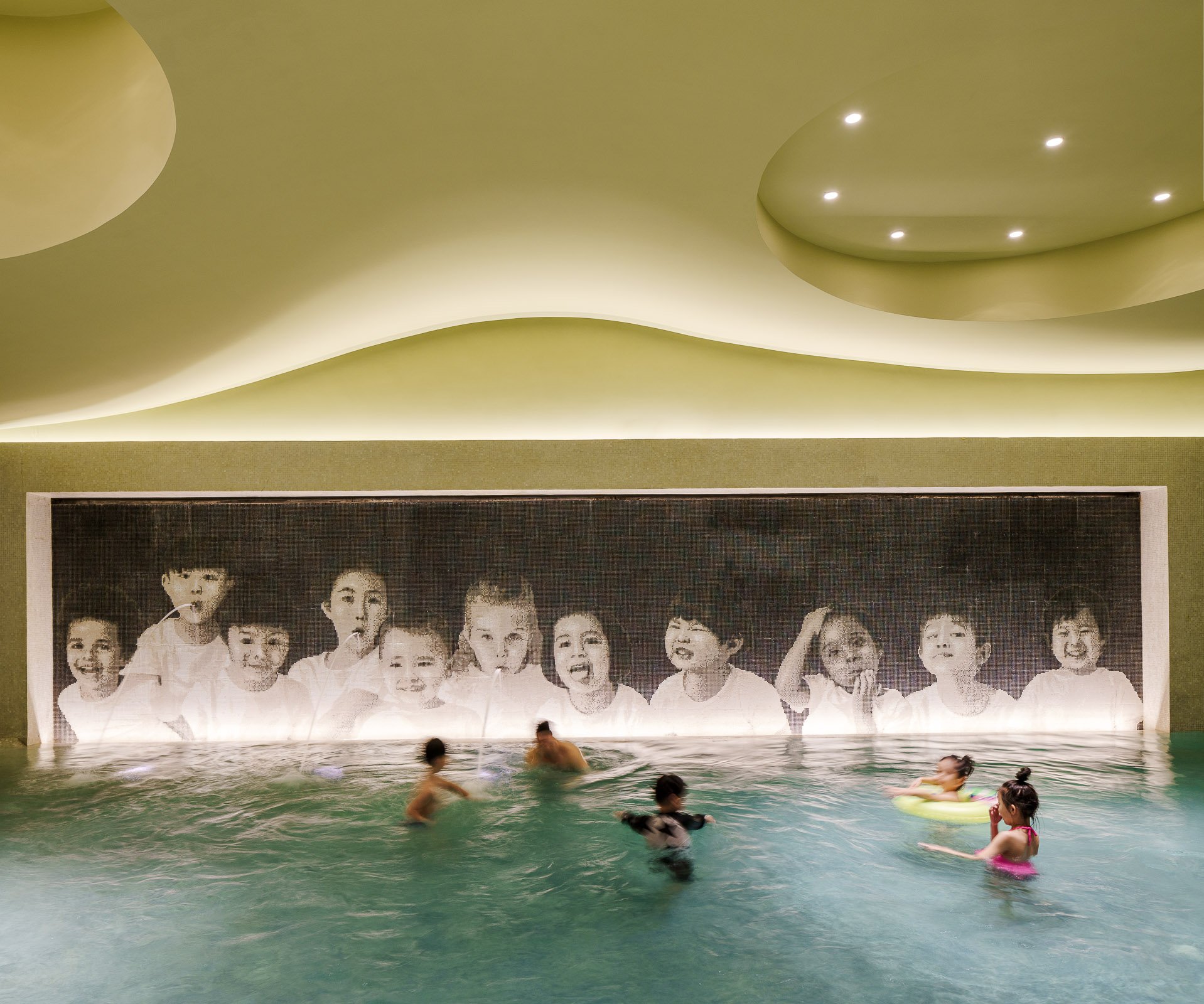
Sangha Retreat by Octave is a life learning and wellness community on the shores of beautiful Yangcheng Lake, Suzhou. Sangha seeks to re-establish the connection and unity between people and the inner self, others, and nature. One of the best and largest of wellness centers in China, it offers an eclectic selection of premium lifelong learning and wellness programs, ranging from wellness spa packages to fully-serviced hotels and lakeside villas, with custom medical evaluation and services, body training, early education and a gourmet restaurant as part of the experience.
With lifelong learning standing at the center of the idea, Sangha exults in the serendipity and quietude it enjoys as an ex-urban resort, while enjoys convenient transportation to nearby cities – 15 minutes’ drive to Suzhou, 1 hour or so to Shanghai. Here, within a surrealistically beautiful surrounding, take a retreat from fully-packed schedule and enjoy a moment of calm and intimacy. Meet like-minded friends at Sangha and embark on a journey of body, mind and spirit discovery and bonding.
The design of the resort was overseen by New York based design firm TsAO & McKOWN.
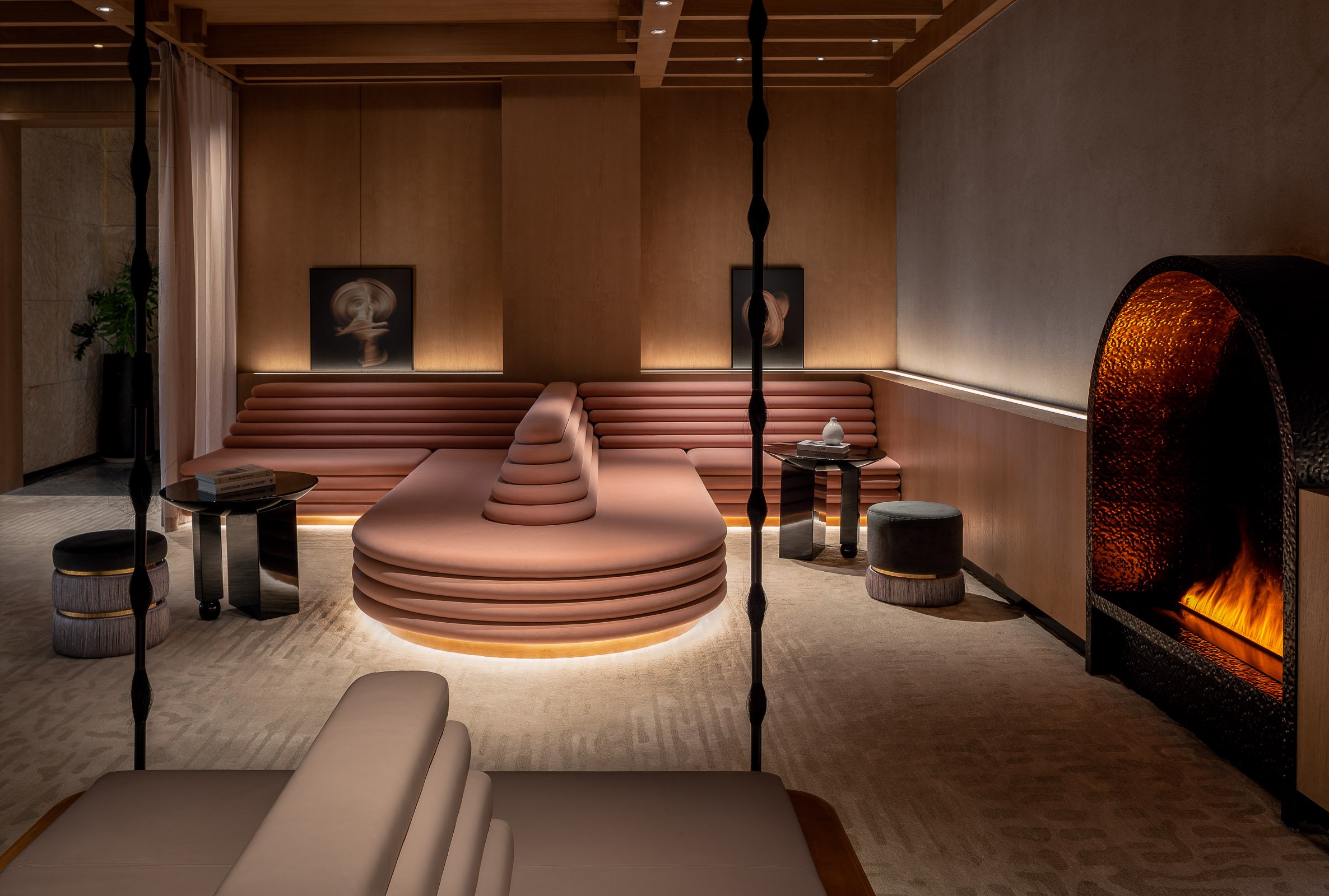
Hotel Indigo Hangzhou Uptown, situated in the picturesque West Lake scenic area, is more than just a hotel; it's a journey through time and culture. The design concept seamlessly weaves the intricate threads of history, art, and modern luxury, creating a space where ancient and contemporary cultures converge perfectly. The hotel captures the essence of the Song Dynasty's legacy while embracing the avant-garde aesthetics of the present day.
The hotel boasts 136 thoughtfully designed rooms and suites, each reflecting the elegant storytelling quality of the neighborhood. Two distinctive types of accommodation, the "Four Arts" of the Southern Song Dynasty and Lin'an Imperial City Night, offer guests an immersive experience in the captivating world of Song culture.
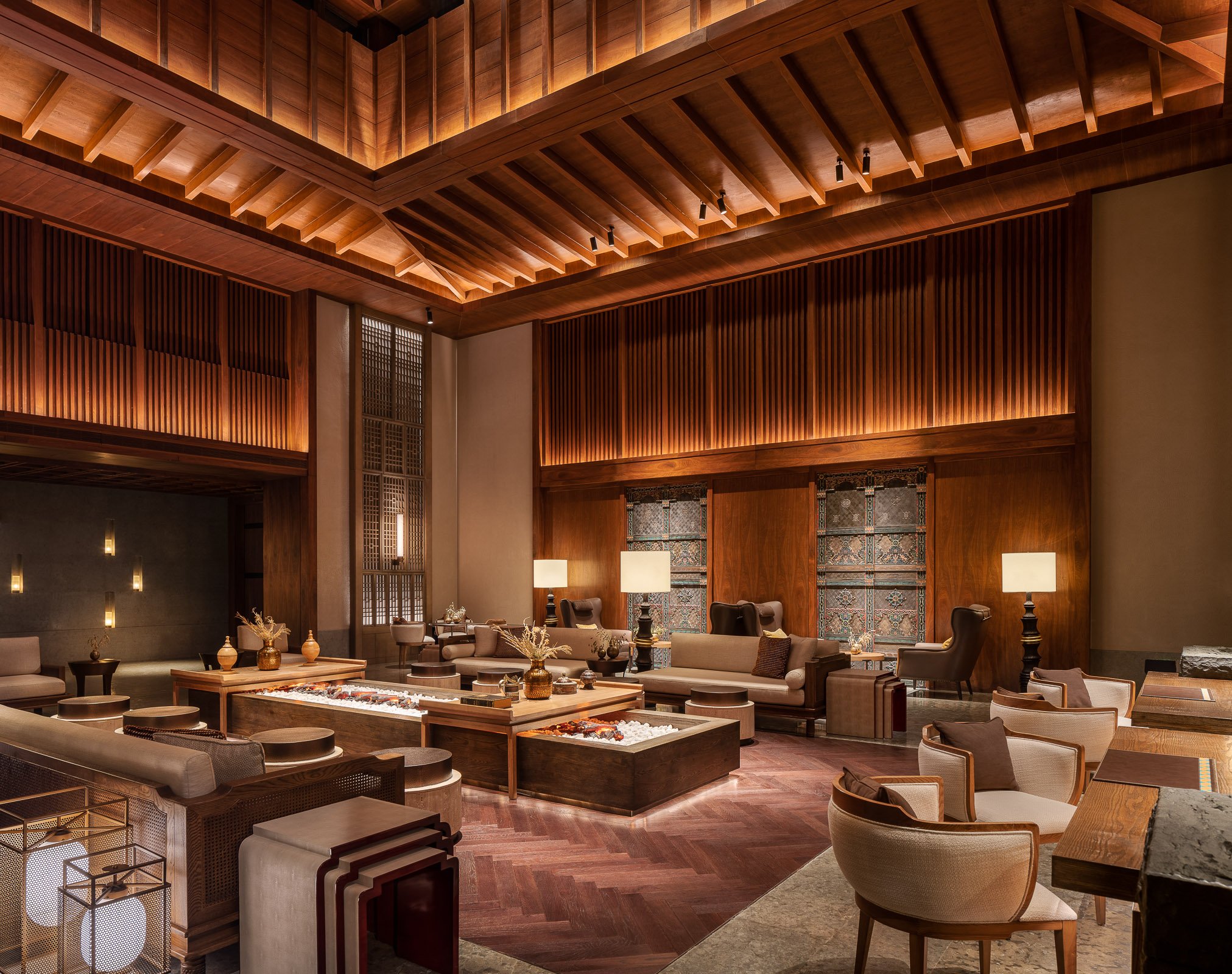
This stunning resort is nestled between in the mountains on the Tibetan Plateau and situated just a short ride from the UNESCO World Heritage site of Jiuzhaigou Valley. The resort’s design allows guests to experience local Tibetan culture and natural beauty in a luxurious setting by weaving in features of the traditional Amdo culture and blending the design harmoniously with the unique natural surroundings. The design team was tasked with utilising some of the existing spaces and designs from the adjacent Hilton hotel and upgrading them to create a distinct and upscale look for the luxury Conrad brand.
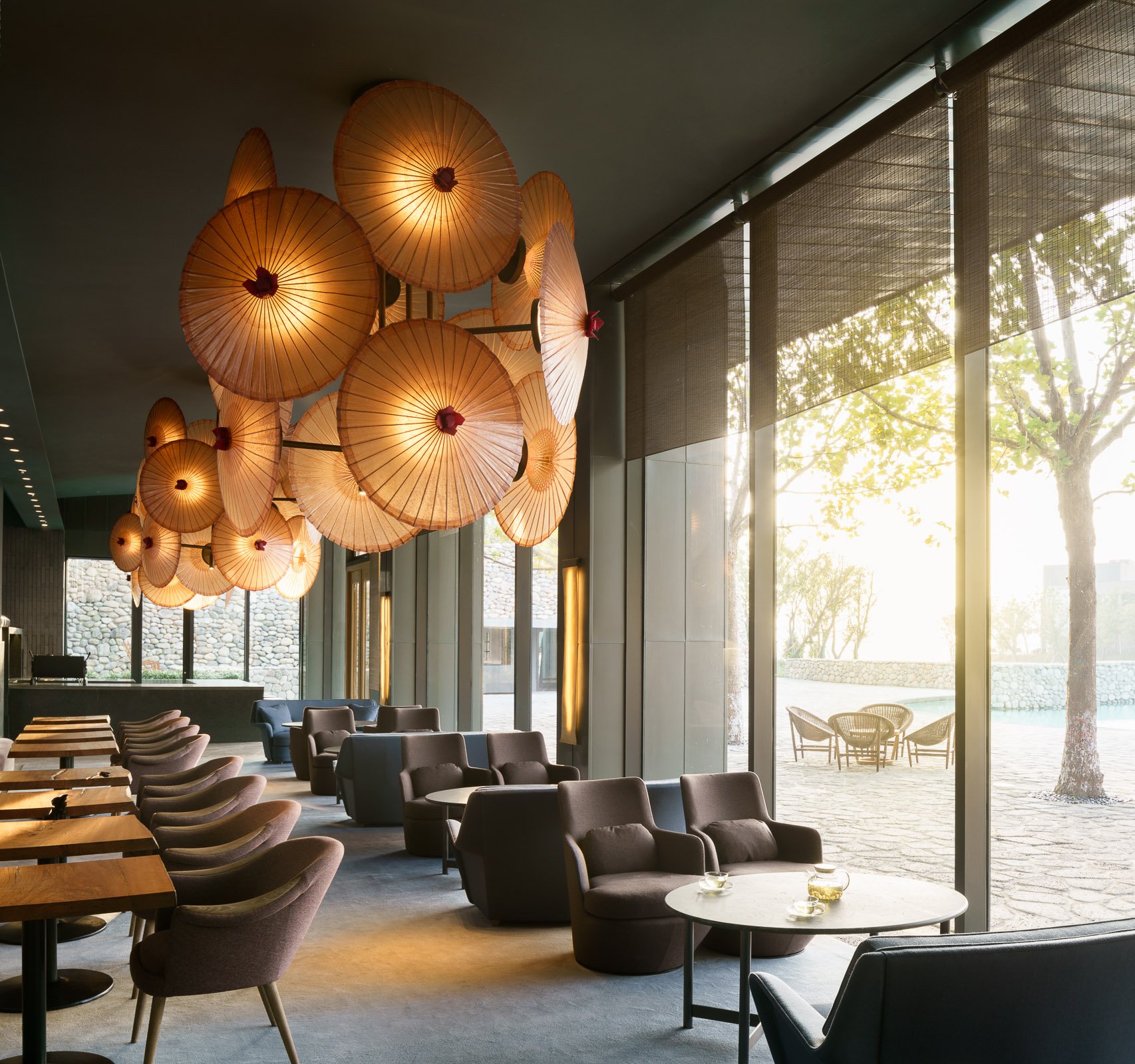
Sangha Retreat by Octave is a life learning and wellness community on the shores of beautiful Yangcheng Lake, Suzhou. Sangha seeks to re-establish the connection and unity between people and the inner self, others, and nature. One of the best and largest of wellness centers in China, it offers an eclectic selection of premium lifelong learning and wellness programs, ranging from wellness spa packages to fully-serviced hotels and lakeside villas, with custom medical evaluation and services, body training, early education and a gourmet restaurant as part of the experience.
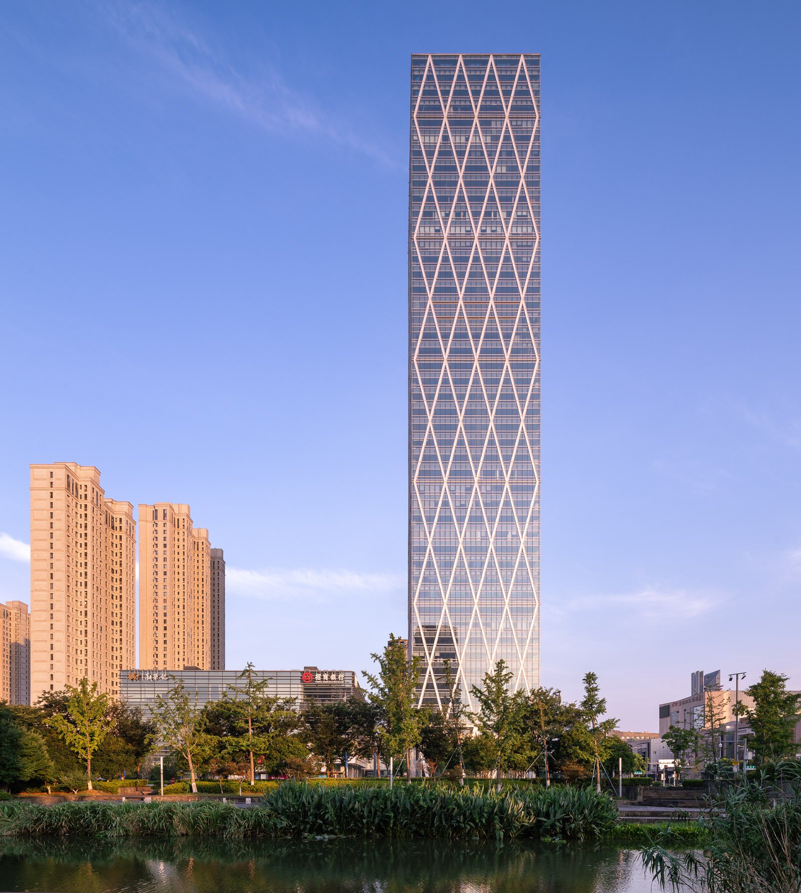
Guohua Financial Tower, a 45-story office high-rise and adjacent four-story mixed-use podium, is set to rise in Ningbo, China. As a model of simplicity, sustainability, and urban connectivity, the complex propels the evolution of a dynamic central business district in the port city.
Situated along a prominent east-west boulevard in East New Town, the site’s new public spaces are organized to draw tenants and visitors from all directions. A plaza features highly visible public art, and the low-rise building’s primary functional spaces are lifted to create an inviting open-air courtyard whose light-filled terraces, waterfalls, and serene reflecting pool demand attention. A spacious glass atrium directly connects the retail court to the office tower’s lobby, which enjoys an equally strong and welcoming 360-degree presence.
Guohua Financial Tower’s skyscraper is highly efficient in plan and execution. A visible steel-and-concrete diagrid creates a memorable diamond pattern for the facade; it also reduces structural stress on the building’s core, enabling it to occupy less space at the middle and upper floors and allowing office plans to be open and flexible throughout.
Underscoring the entire project’s commitment to sustainable workspace, the tower contains two multistory sky gardens. Here, natural and mechanical systems interact in an innovative fashion, as living walls provide natural filtration for the air circulating throughout the building. These vegetated surfaces also figure into a circuit that filters rainwater for irrigating landscaping and replenishing the plaza’s reflecting pool. The high-performance design of Guohua Financial Tower targets both LEED® Gold and China’s Three Star certifications.
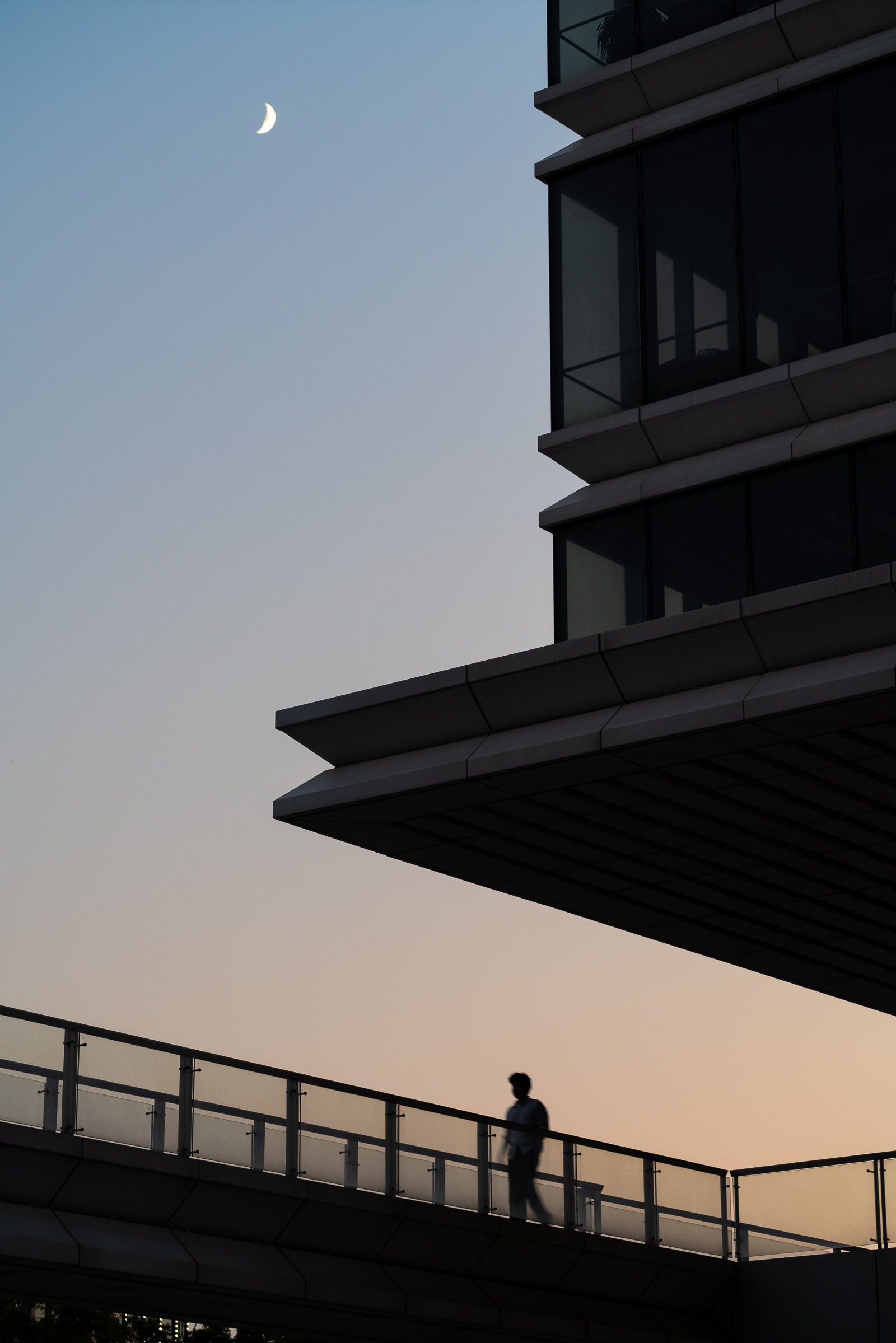
Located alongside Huangpu River in Yangpu District in Shanghai, Shandong Gold Poly Plaza was designed by leading architecture firm SOM. Consisting of four buildings of differing heights, the project covers more than 100,000 square meters.
An exterior bridge connects 3 of the towers and faces the Huangpu river just to the south. Architects pushed back the first floor of each building by 4 meters in order to lower density, creating a more spacious campus.
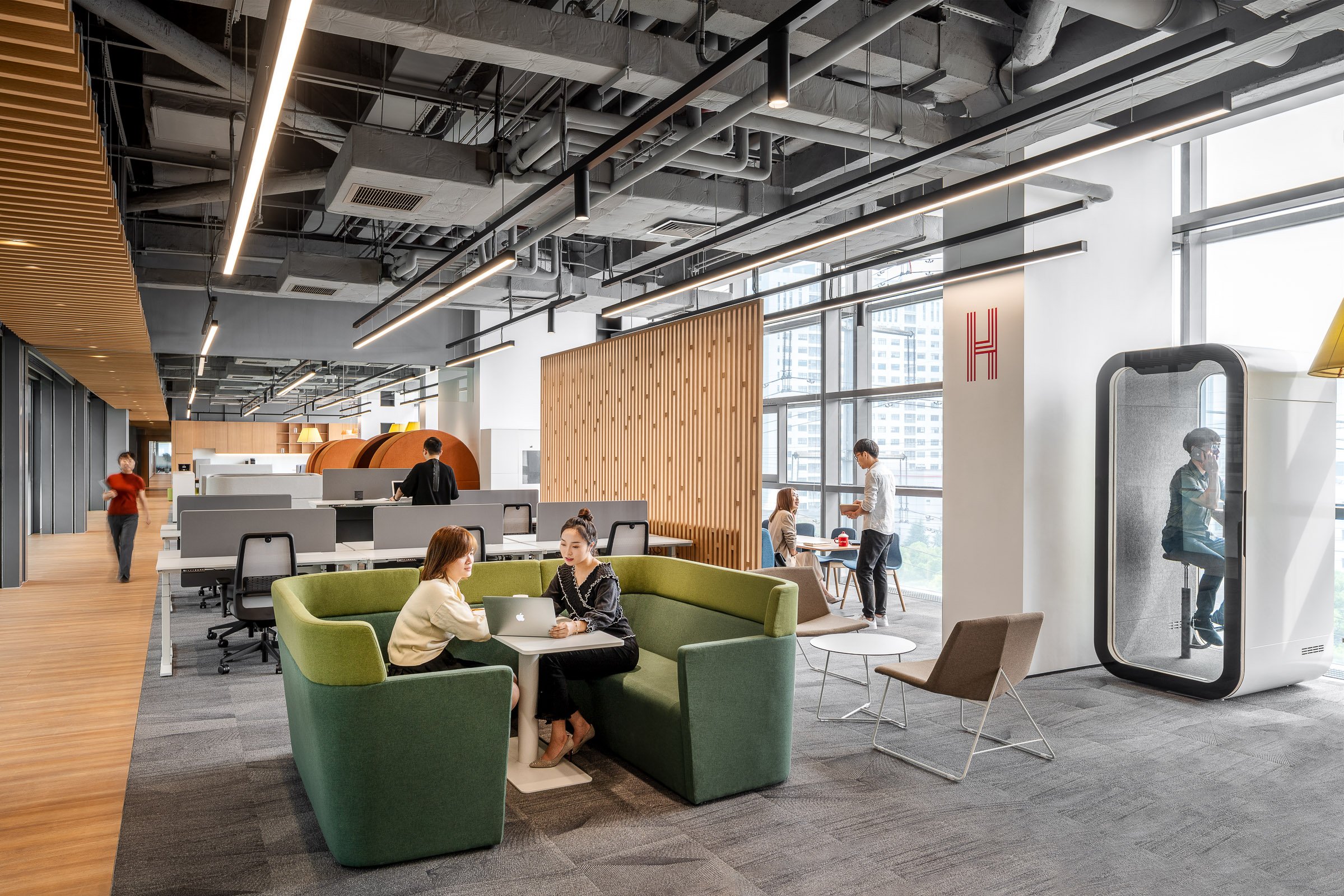
In response to rapid business growth, artificial intelligence company SenseTime wanted to establish its Chinese headquarters in the Caohejing Development Zone of Shanghai. We created a high-performance office environment that encourages social collaboration and prioritises wellbeing. The new headquarters spans 22,000 sq m across seven floors and reflects the company’s technology and research DNA.
Informed by comprehensive workplace strategy studies, the design of SenseTime’s China headquarters creates a human-centric work environment for up to 1,400 employees. As the AI business experiences rapid change, the space addresses this with agility and mobility. It helps staff to communicate, collaborate and socialise in a diverse, choice-rich setting. High technology creates impact throughout the user journey in a space that serves brand and business.
Inspired by the company’s culture of resilience and progressive innovation, typical work floors are open plan with glass partitions demonstrating SenseTime’s values of transparency and collaboration. Windows provide maximum daylight with public spaces for discussion and recreation to support wellness. The space encourages vertical movement and communications across different floors with meeting rooms, the exhibition hall and multi-functional spaces located at the building’s centre. The third floor features a variety of spaces for visitors, providing easy access for meetings while maintaining privacy for the work floors above.
As SenseTime’s first self-owned property, the workplace creates a memorable spatial journey. Carefully considering the needs of staff, the space brings to life the company’s youthful and innovative spirit. Inspired by the Moebius Ring (a surface with only one side and one boundary curve), custom wooden furniture in the third-floor atrium helps create a fluid flow, symbolising a non-stop, circular pursuit of innovation. Featuring flexible seating, the multi-purpose staircase can host town halls, social events and recreation.
A flexible layout and smart office facilities support experimentation with SenseTime’s latest innovative products. These include wall-mounted smart panels for meeting room reservations, face recognition access control and smart locker systems. The second-floor multi-functional hall has a 5-metre-wide full-colour LED display and high-definition speakers for events including product launches and public affairs meetings. The walls feature sound-absorbing sandstone, and a starred lighting design on the ceiling creates a futuristic feel. Digital screens in public areas across floors display air quality figures and other wellness statistics.
Designed to meet LEED and WELL standards, the space includes low-carbon materials and addresses physical and mental wellbeing. Adjustable furniture on the office floor allows employees to choose how to work based on departmental, team and individual needs, for autonomy and comfort. The cafeteria, gym and sleeping pods turn the workplace into a multi-functional destination, helping it to attract and retain talent in the competitive field of AI.
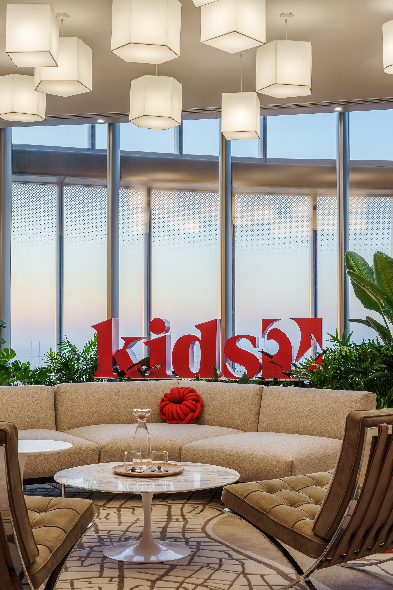
With an objective to make parenthood easier, “one tiny win at a time”, Kids2 has been inventing baby products for more than 50 years. Growing its China operations to attract world-class professionals in every department and engage with various partners within its ecosystem, Kids2 required a high-performance space to not only bring staff together but create an environment that fuels innovation, creativity and transfiguring ideas within its teams and with its partners.
It was also important for Kids2 to create a space that cultivates its entire growing enterprise of entities that include a media company, multiple joint ventures and a venture capital arm.
—————————————————————————————————————————
To create this hub – one of five across the globe - M Moser convened a team of workplace strategists, interior and brand designers, workplace technology experts, and wellness specialists, to achieve the ambitions of the space through a holistic approach.
“Thanks to the brilliant team at M Moser, we’ve designed the space uniquely to our needs by embracing modernist principles like open plan, honest materials and simple volumes to build a design-driven environment.
It is very conducive to our employees to encourage creativity and collaboration while showcasing our products and content for our partners and customers. ”
David Butler
Chief Growth Officer
Kids2
Project highlights
Honouring core brand values in a design-driven workplace
Evoking emotional connections through a culturally-influenced journey and brand accessories that inspire fond childhood memories
Nurturing meaningful visitor engagement through digital touchpoints discreetly embedded throughout the space
Delivering a healthy, WELL-targeted environment to support Kids2’s commitment to sustainable growth
——————————————————————————————————————————
Translating key values into design details
The design concept was inspired by Kids2’s emphasis on ingenuity and its community-centric approach to create a playful and interactive environment. Bold colours sit in juxtaposition to calming and cosy neutral backgrounds, tailored furniture, careful design details and curated brand accessories.
Printing, storage and mailroom spaces have been planned along a red “ribbon” core. The design discreetly conceals these areas with key brand elements. This intuitive wayfinding creates distinct signals to users, without sacrificing the design intent.
This approach combined with the bold use of signature colour, premium materials and tailored detailing serve as an authentic nod to Kids2’s aspiration to be a design-driven company, transforming parenthood through carefully developed, holistic solutions.
Elements from traditional Chinese games including Jianzi, Tuoluo and Kongzhu, have been translated into creative signage and installations. These graphics connect the brand’s international legacy with its commitment to local consumers.
Playfulness in every encounter
Guided by a “Playground” concept, the workplace features a series of artworks inspired by local scenery, known as “Joy in the Lane”. Showcasing the brand’s products in Shanghainese Shikumen lanes, these visual elements trigger fond memories for local visitors and create an emotional connection to the brand.
Customised carpet at the front of house features a map of Shanghai, emphasising its central, premium location in the financial district. Unique, lantern-shaped lighting pays homage to Chinese culture.
Other culturally influenced items to engage and delight include knot pillows, sponge holders and small food baskets. To reinforce branding and humanise the workplace experience, the team curated a series of accessories such as water bottles, cups and felt coasters.
Manifesting Kids2’s innovative spirit, the reconfigurable work areas feature multiple flexible, modular set-ups to support different creative activities.
A carousel showcase stage in the product showroom takes visitors on an interactive journey to experience a series of products ranging from entertainers, swings to toys and play mats. Flexible lighting, hangers and graphics support the display of a variety of products in a versatile environment.
An immersive digital journey
Digital storytelling was a critical component. Kids2 wanted to create a seamless experience for developing engaging digital content.
Upon arrival, visitors are greeted in a lounge area featuring biophilic elements. This sets a bold sustainability statement against a backdrop of the spectacular Shanghai skyline. As the journey unfolds, visitors can capture a selfie that is organically embedded on the “face mosaic” LED screen. This celebrates each unique visit and the organisation’s philosophy of “tiny wins.”
The digital experience area features four projection set-ups and acoustic facilities for a seamless, immersive experience. Supporting AR integration, it takes visitors on an interactive journey to explore brand stories, the latest product prototypes and other digital content.
Activating engaging learning sessions and addressing space limitations, the showroom is equipped with iPad displays for easy digital access to Kids2’s brand portfolios: Baby Einstein, Ingenuity, and Bright Starts.
Hand in hand with Kids2 stakeholders, M Moser’s multi-disciplinary team delivered a WELL-targeted, high-performance workplace. This culturally resonant space champions brand story and business ambition while strengthening connection with customers and partners in China.
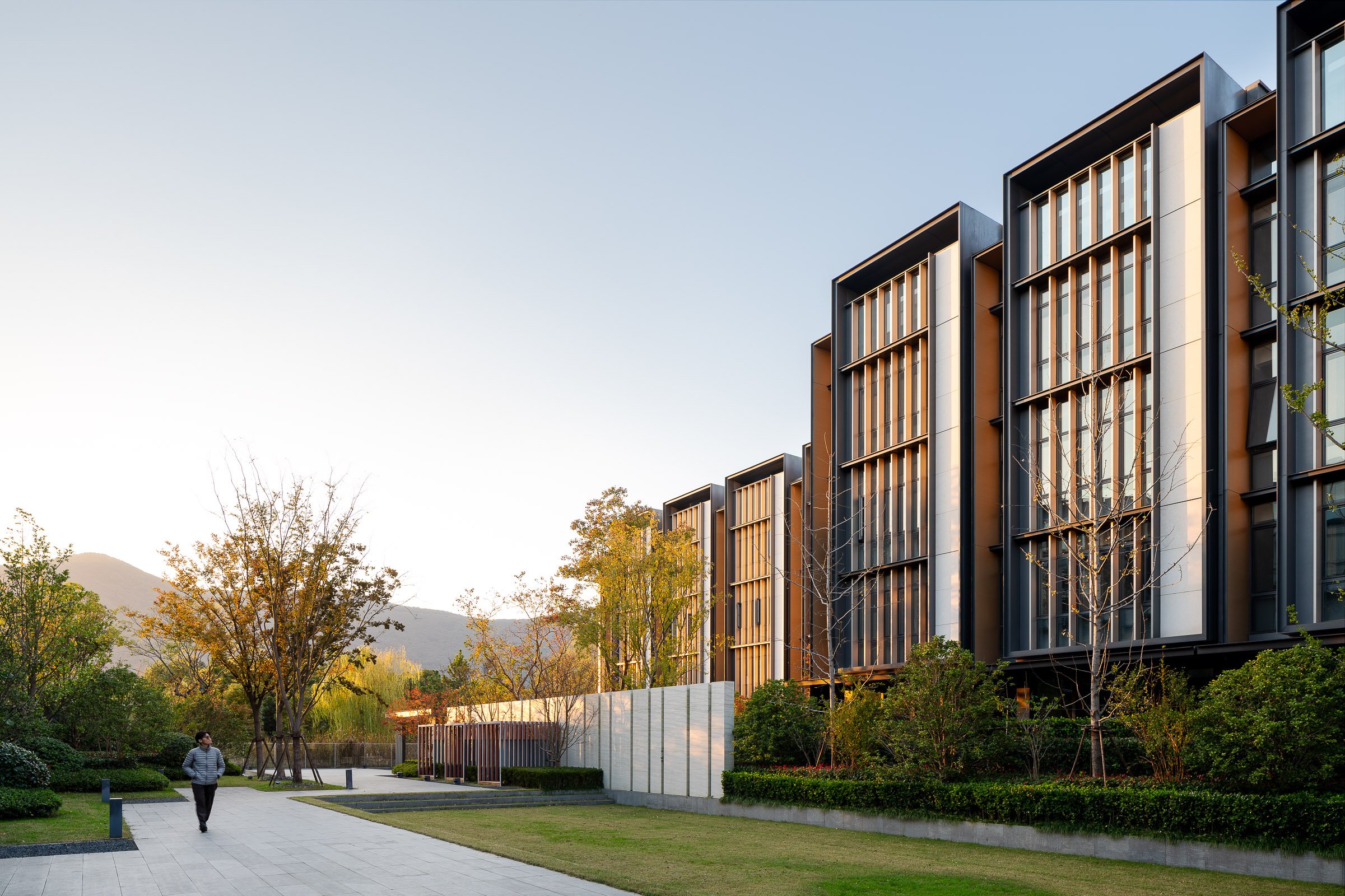
Da Xiang Shan She residential complex is adjacent to Dayangshan National Forest Park in Suzhou, a famous historical city in China. Designed by SCDA.
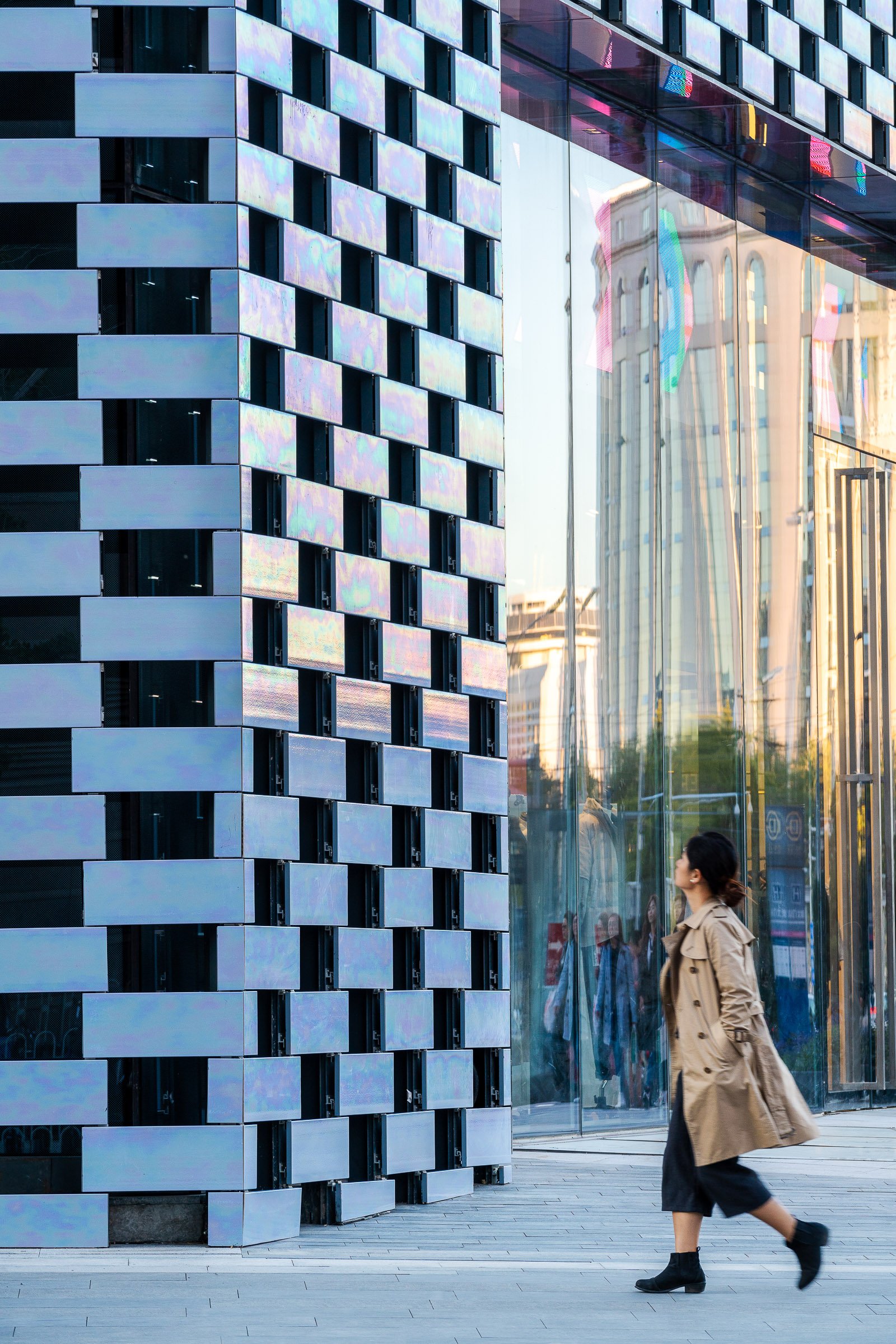
The Beijing KWG·M·CUBE, a 40,000-square-metre shopping centre designed by MVRDV, has completed construction in Beijing. Asked by the client to make the building a visual statement, MVRDV created a multifaceted volume that responds to its surroundings with a pearlescent ceramic façade, which shimmers in a spectrum of colours under changing light conditions.
Located just within Beijing’s innermost ring road, the KWG·M·CUBE is prominently located next to the Beijing Railway Station and near to both the Temple of Heaven to the Southwest, and Tiananmen and the Forbidden City to the Northwest. Given this prime location and the consequent value of the land, the client wanted a building that would stand out from its mostly beige and grey neighbours, while also packing a large amount of space into a relatively small footprint. Contradicting this request were the desires of the city government, whose preference was for a building that would fit in with its muted surroundings on the busy street.
MVRDV was commissioned to design the building’s exterior and responded to these competing hopes with a 7-storey volume that rises to the maximum allowed height of 36 metres—an unusually tall building for this kind of mall. The shape of the building was generated by cutting the volume at various angles to orient the façades to face key locations, such as the railway station and an intersection on the other side of the street, generating a shape that is both contextual and recognizable in its visual presence. It also allowed MVRDV to include open-air terraces on each level, which are symbolically oriented towards landmarks such as the Forbidden City and Temple of Heaven—some visible from the building, others more distant—to root the building in its location.
The building is wrapped in a pearlescent ceramic façade that at different times appears either grey or colourful, creating a subtle façade that does not need large LED screens to stand out and catch the attention of the passers-by. Hand-glazed in China, these tiles were made by applying three layers of glaze to the ceramic, and firing at a different temperature each time.
“We designed the KWG·M·CUBE so that the building continuously displays new patterns and colours. Depending on the weather and light conditions and where you stand, the façade might look subtly grey, or it might shine with all the colours of the rainbow,” says Jacob van Rijs, principal and co-founder of MVRDV. “In this part of Beijing, there are restrictions on architecture and many nearby buildings are completed in shades of grey and beige. Our solution allowed us to do exactly what the client and the city wanted: to create an attractive visual statement in which exuberance and modesty go hand in hand.”
The surface treatment of the façade also breaks up the mass of the building while responding to the light and view requirements of the interior program. While some areas of the surface were required to have blind facades to accommodate the stores behind, other stores are able to use diffuse light to their advantage, and here the ceramic tiles are used in a checkerboard pattern. In other places such as lobbies and cafes, fully glazed facades provide a visual connection between the inside of the shopping centre and the mall.
To accommodate the building’s 7-storey height, MVRDV proposed to split the KWG·M·CUBE shopping centre into two layers: on the lower 3 floors is the daytime shopping centre, which mostly hosts retail stores, while the upper levels feature more restaurants, bars, and cafés, and will truly come alive at night. In order to allow the upper floors to function while the lower floors are closed, an express elevator from the ground level takes visitors up to a second lobby on the fourth floor. To complete this layering effect, a landscaped roof terrace allows visitors to relax outside when the weather is pleasant.

The Taikang Sanya, a Tribute Portfolio Resort, located in Haitang Bay, is a high-end hotel developed by the Taikang Insurance Group, a Fortune Global 500 company, and managed by Marriott International,Inc. Designed by the globally known Neri&Hu Design and Research Office, the hotel features a total construction area of nearly 80,000m2 and a greening rate of 50%. The hotel promises guests an unparalleled resort experience with the state-of-the-art service and unique products in a pristine and serene natural environment. The thoughtful design ensures the facilities can be accessed by guests of all ages so they can enjoy an incredibly comfortable and pleasant stay.
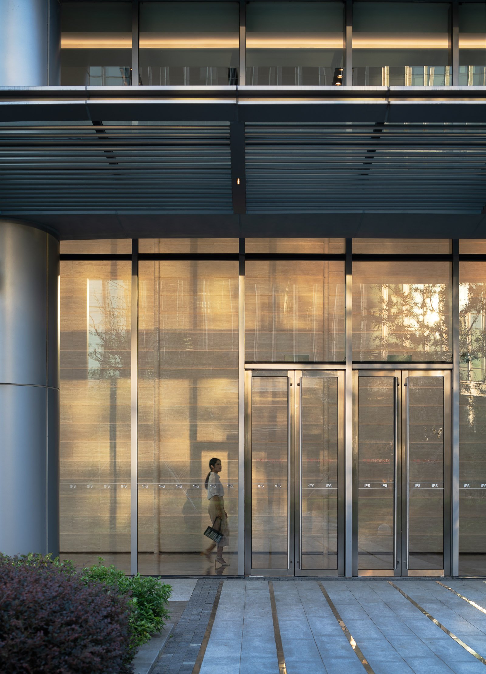
Located in a district north of the Shanghai Train Station, One Financial Street Shanghai is a new central business district made up of a cluster of five office towers. Brewin created an arresting feature installation in the central core of each of the five lobbies with a series of six-meter tall ‘wall-peels’, created by stacking solid bands of bullnose-edged travertine marble.
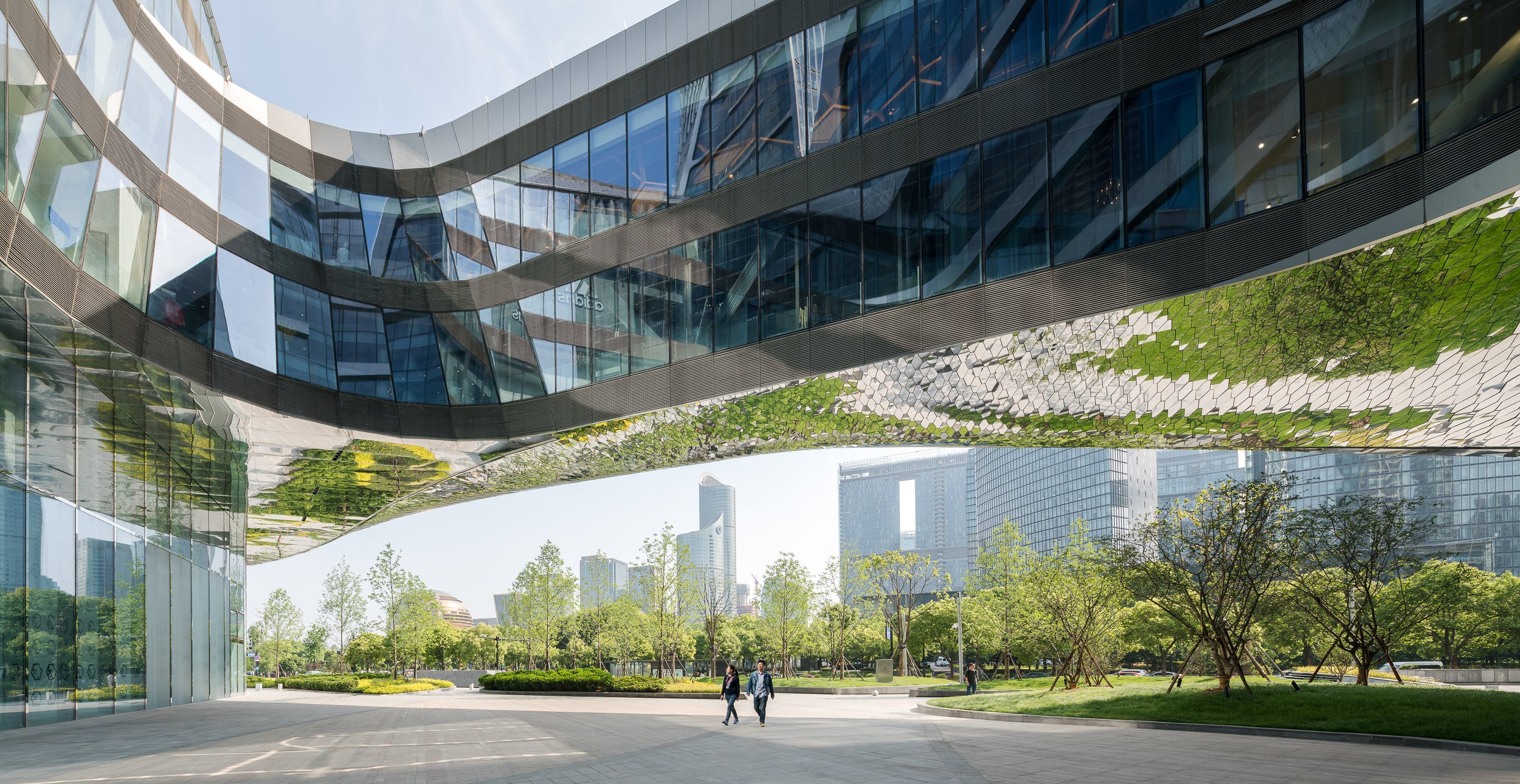
Raffles City is a sustainable urban hub for living, working and leisure located in Hangzhou, one of China's most picturesque cities. Situated 180 kilometres south-west of Shanghai, Hangzhou is one of China's most prosperous cities, especially renowned for its scenic landscapes. Located in Qianjiang New Town near the Qiantang River, this mixed-use development becomes a major landmark along the green axis of the city's new CBD. A rich mix of 24/7 functions occupies almost 400,000m2 within two stremlined towers set atop a podium and landscaped plaza.
The architectural expressions throughout the building connect the combined programmes in one seamless flow. The 116,000m2 retail podium at the base of the tower begins this interconnected flow, organised as two diagonal and intersecting figure-of-eights. It accommodates retail, restaurants, leisure facilities and parking and has a direct underground connection to the metro. This wide range of mixed-use functions, not only provides residents and those working or staying in the complex with a healthy and socially integrated environment, it also ensures that programmes are active around the clock, creating a safe and lively neighbourhood for all.
In the design of the two towers, the urban face of the project twists towards the landscape, while the landscape aspect, in turn, acknowledges the urban context. Through this, the urban context and the landscape of the city are consolidated in one gesture. The main entrance to the south of the corner site appears as a prominent gateway from the city park and civic centre, as it borders both the urban built-up context and green axis/city park that connects West Lake to the Qiantang River. Reflecting the movement in the river, the tower design features a wave-like motion. These concentric waves increase in their dynamism, starting calmly at the base and building up more vigorously along the vertical axis.
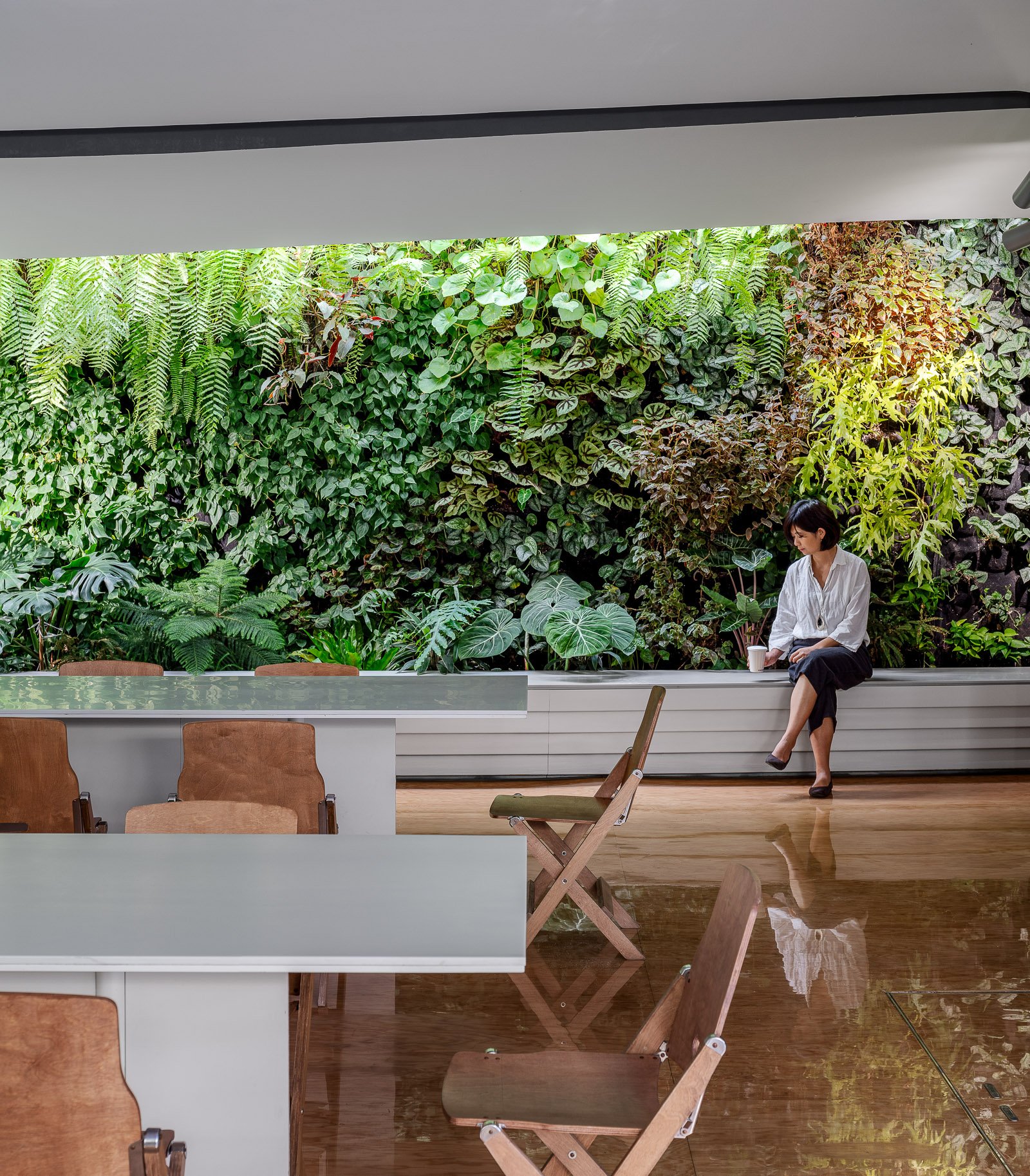
Cucurucu is a drink and snack bar that focuses on drinks made from coconut water. Located in the space formerly housing Bloom on Tongren Road in the heart of Shanghai, it enjoys a view of the tower of the historic Jingan Exhibition Center.
The interior by TomYu Studio is slick, minimalistic and organic. Lush plants and green walls contrasting with monotone finishes create a modern urban jungle atmosphere.
The space exemplifies a seamless indoor outdoor space. Featuring a large ground level garden, a rare find for downtown Shanghai, the cafe has an interior section with a full-length green wall also.
Neighboring the Jingan Temple commercial area, this F&B destination provides a small urban retreat for the hustle and bustle of the city.


Emulating the Fushan Hill to the west and Laoshan Mountain to the east, Qingdao Financial City features a pair of iconic towers that create a new gateway for the city.
Qingdao Financial City is located centrally in the Qingdao Laoshan District and is an international, mixed-use development at the core of the Jinjialing new financial area. A high-value, regional and cultural landmark, the project consists of Class-A office space and luxury five-star hotels. Qingdao Financial City provides an urban center that balances modernity with timelessness and reinforces strong internal and external connections to the city. The project links directly to a large plaza south of the site, which offers a key gathering place and provides a venue where the client and tenants can host gatherings and festivals.
At 193-meters tall, each tower consists of five glass “jewel” boxes stacked vertically, symbolizing the prosperity of Jinjialing as a new financial center for the Northeast region of China. The glass boxes decrease in height as they ascend, forming a gradated, elegant silhouette. The shape of each box is chamfered at the corners to emphasize the prismatic nature. This design also reduces the wind loads on the tower, increasing their stability. Recessed mechanical floors sit between boxes, allowing for inconspicuous and efficient mechanical ventilation. At the base, a podium connects both towers through roof terraces, a grand ballroom, and dining spaces that sponsor an active mixed-use lifestyle.
The Tianjin CTF Finance Centre is located in the Tianjin Economic-Technological Development Area (TEDA), an outer district of Tianjin, China. The design uses undulating curves to subtly express three programmatic elements while presenting a bold monolithic expression on the skyline. The 530-meter-tall skyscraper will house office space, luxury serviced apartments, and a hotel.
By stacking reducing floor plates, the tower tapers dramatically to minimize the surface area exposed to wind, sun, and moisture. The gently undulating curves of the façade subtly denote the integration of the three distinct programs within a singular smooth object. Square in plan with rounded corners, the floor plate geometry enables unique interior fit-outs and customization options for occupants. Research by the architect has shown that lateral forces due to vortex shedding can be controlled by tapering the vertical profile of the tower and softening any sharp corners in plan. The building’s aerodynamic shape greatly reduces this vortex shedding by “confusing the wind” and disrupting the opportunity for any resonating wind forces and loads on the structure.
The softly curving glass skin integrates eight sloping megacolumns that follow a lyrical line connecting the centers and corners of all four elevations. These curving megacolumns increase the structure’s response to seismic concerns and are integral to both the gravity and lateral systems. They are effective in increasing the stiffness of the building’s perimeter frame, consequently attracting a larger portion of the seismic forces in compliance with the Chinese code requirements.
The façade reinforces the curvature of the tower form and creates a shimmering texture over the building’s surface. The crystalline-like curtain wall stretches from the suspended glass canopies at each of the lobbies to the dematerialized, megacolumn-looped crown and presents a bold expression of a comprehensive, integrated design on the Tianjin skyline.
This new 150-meter-tall, mixed-use tower in Bao’an, Shenzhen, will be a world-class benchmark for sustainable design that uses naturally ventilated atria and a column-free external structure.
Vertical atria stretching the full height of the tower's east and west facades will provide ventilation and natural air circulation, improving the building's mechanical performance. Adjacent to a public park, and only three blocks from the sea, the tower will offer inhabitants spectacular views at every floor via the tall atria.
The structure will be an external steel diagrid, a symbol of SOM’s rich tradition of integrating architectural design and structural engineering. The diagrid will be pulled away from the facade, enabling flexible and column-free interior office space. It also will provide solar shading.
Nestled on a private island amidst the scenic Jinji Lake in Suzhou, renowned for its breathtaking gardens, Four Seasons Suzhou emerges as a seamless integration of outdoor and indoor spaces. Guests are invited to embark on an immersive journey through enchanting natural surroudings, starting from the island arrival and extending through vibrant social areas into luxurious accommodations.
Guided by the architectural principles of classical Chinese courtyards, Four Seasons Suzhou beautifully captures the essence of Suzhou culture through the integration of the Chinese architrave as a pervasive design element. Paying homage to the city’s rich cultural legacy and the botanical elegance of its gardens, the hotel meticulously preserves this essence within the overarching theme of “One step, one scene” (一步一景), where each step reveals a unique scene.
Four Seasons Suzhou’s design language skillfully marries the finest aspects of Suzhou, harmonizing elements of nature, culture, art, and architecture with a contemporary touch across its distinct spaces: Central Courtyard - Lobby Spaces; Urban Treasure - Function Venues; Retreat Escapes - Recreational Areas and Urban Oasis - Accommodations. These spaces blend cohesively, forming an Urban Sanctuary.
The dynamic city of Shanghai welcomes a groundbreaking addition to its vibrant tapestry with the grand unveiling of Kimpton Shanghai. Designed by the visionary Robbyn Carter, founder of Studio Carter, this newly inaugurated hotel promises to redefine hospitality by blending artistic innovation with community engagement.
Nestled in the heart of Shanghai, Kimpton Shanghai is not just a hotel; it's an immersive experience that beckons the creative community. Studio Carter's meticulous interior design has transformed the space into an open door that fosters connections among local creators, visionaries, and dreamers.
With an ethos of celebrating contrasts, the hotel bridges the gap between tradition and modernity, all while inviting guests to delve into the local creative pulse.
From arrival, Kimpton Shanghai envelops its guests in an unparalleled hospitality that encourages cultural exploration. The reception area doubles as a cultural curator, offering curated experiences that extend beyond its walls. Guests can delve into the local scene through specially crafted Kimpton playlists and a thoughtfully selected array of books.
The Discovery Bar, a unique welcome concept, empowers guests to personalize their stay by selecting amenity scents and teas that resonate with them. Kimpton Shanghai is replete with moments of discovery; hidden cabinets, private gardens, and exclusive reading nooks pepper the premises, providing havens for relaxation and inspiration.
A fusion of Shanghai's European influences and a futuristic interpretation of Shikumen architecture graces the hotel's design, paying homage to the city's heritage. The hotel's pièce de résistance is its Franco-Chinois-inspired brasserie, where contemporary Chinese flavors merge harmoniously with French culinary finesse. The dining area's atrium-inspired design seamlessly melds indoor and outdoor spaces, leading to a lush garden terrace boasting its chef's garden, a true embodiment of farm-to-table gastronomy.
As if curated by a symphony conductor, the bar, inspired by 18th-century French salons, orchestrates an intimate space that invites dialogue and serendipitous encounters. Live music, DJ sets, and spoken word performances foster an atmosphere of enlightenment, where local artists and cultural organizations find a platform to share their inspirations.
The guest rooms at Kimpton Shanghai exude an air of luxury and tranquility. A captivating stone hearth cradles a candle fireplace, inviting guests to unwind and recharge. Modern conveniences are seamlessly integrated into each room, with cleverly concealed mini-bars and a commitment to reducing plastic waste. Filtered water taps eliminate the need for disposable plastic bottles, underscoring Studio Carter's dedication to sustainability.
Bathrooms are reimagined as personal sanctuaries, with custom-made bathtubs and European timber-style floors that exude elegance. Kimpton Shanghai is a testament to Studio Carter's commitment to luxury and environmental responsibility, promising guests a space to rediscover and rekindle their connection with each stay.
Embark on a journey of discovery at Kimpton Shanghai, where every corner tells a story, and every visit unveils a new layer of creativity.
Designed by Moore Ruble Yudell (MRY), Ge Hekai is anchored by an 800-seat central forum at Wenzhou-Kean Univeristy. The building houses the university’s architecture, design, and computer science programs, is made to be occupied by students from around campus. The space features three stories of tiered seating overlooked by open balconies and an overhead bridge connecting the hall’s east and west wings.
The Wenzhou-Kean campus, a 175-acre site surrounded by mountains about an hour south of Shanghai, was created through a master plan by Michael Graves’s office that placed the university’s architecture and design schools (both named for Graves himself) at its center.
Eight oblong “bar” buildings, clad in Angola black granite, form the structure’s three-floor base, hosting community spaces and classrooms, flexible exhibition areas, a makerspace, a digital-media auditorium, and a lakeside café. Punched windows and deep inset ledges emphasize the three-foot thickness of the walls while also providing interior shading and hiding mechanicals and ductwork.
The bars are capped by two striking, daylit studio loft buildings, which form the fourth and fifth floors and offer more traditional architectural design studio spaces. These are fronted with ultra-high-performance concrete (UHPC) sunshades.
As the hall welcomes students from near and far, and from different disciplines across campus, it is on its way to achieving its potential as a campus gathering place and an incubator for the future. “This is a place for architecture, urban and industrial design, and computer science; by the time you put all those things together, you’re talking about the future fabric of society,” says Ruble.
Emulating the Fushan Hill to the west and Laoshan Mountain to the east, Qingdao Financial City features a pair of iconic towers that create a new gateway for the city.
Qingdao Financial City is located centrally in the Qingdao Laoshan District and is an international, mixed-use development at the core of the Jinjialing new financial area. A high-value, regional and cultural landmark, the project consists of Class-A office space and luxury five-star hotels. Qingdao Financial City provides an urban center that balances modernity with timelessness and reinforces strong internal and external connections to the city. The project links directly to a large plaza south of the site, which offers a key gathering place and provides a venue where the client and tenants can host gatherings and festivals.
At 193-meters tall, each tower consists of five glass “jewel” boxes stacked vertically, symbolizing the prosperity of Jinjialing as a new financial center for the Northeast region of China. The glass boxes decrease in height as they ascend, forming a gradated, elegant silhouette. The shape of each box is chamfered at the corners to emphasize the prismatic nature. This design also reduces the wind loads on the tower, increasing their stability. Recessed mechanical floors sit between boxes, allowing for inconspicuous and efficient mechanical ventilation. At the base, a podium connects both towers through roof terraces, a grand ballroom, and dining spaces that sponsor an active mixed-use lifestyle.
Hotel Indigo Hangzhou Uptown, situated in the picturesque West Lake scenic area, is more than just a hotel; it's a journey through time and culture. The design concept seamlessly weaves the intricate threads of history, art, and modern luxury, creating a space where ancient and contemporary cultures converge perfectly. The hotel captures the essence of the Song Dynasty's legacy while embracing the avant-garde aesthetics of the present day.
The hotel boasts 136 thoughtfully designed rooms and suites, each reflecting the elegant storytelling quality of the neighborhood. Two distinctive types of accommodation, the "Four Arts" of the Southern Song Dynasty and Lin'an Imperial City Night, offer guests an immersive experience in the captivating world of Song culture.
A new destination located just north of Shenzhen’s main central business district, this mixed-use development features two landmark towers, a ballroom pavilion, and a large elevated pedestrian park that connects the hills of the city’s two major parks: Lotus Hill Park to the southwest and Beacon Hill Park to the northeast. An enlivened podium provides a variety of retail experiences, including a large indoor mall and a small-scale shopping village.
Designed with an emphasis on elegance and simplicity, the towers are a timeless addition to the Shenzhen skyline. In order to provide world-class office spaces, the design incorporates flexible floor plates, highly efficient systems, and unobstructed city views—all features that greatly enhance the user experience.
SOM’s architecture and engineering teams collaborated on the design of both signature towers as well as the ballroom pavilion. The taller tower, rising 80 stories and 389 meters, contains office space in the lower floors and a luxury hotel at the top. It is supported by a central core and eight megacolumns at the perimeter, a structural solution which minimizes obstructions and opens up panoramic views. These qualities are further enhanced by the curtain wall design, which incorporates oversized glass on a 3-meter module throughout. The second tower, entirely dedicated to offices, features the same 3-meter curtain wall grid.
The ballroom pavilion features a unique outdoor public terrace that connects to the elevated public green. This 12.5-meter high open-air space frames views of Beacon Hill Park, which lies directly to the east of the pavilion. Two large ballrooms above this terrace offer panoramic views to both the east and west, and restaurants are located on the upper floor. The faceted design of the Pavilion resulted from a structural concept—the folded enclosure to the north, south, and on the roof provides a structural depth which enables the long spans for the ballroom spaces.
SOM also designed the two bridges that connect the site to the parks, which feature a meandering pathway to provide a varied experience along their length. The east bridge descends from the elevated green at a gentle slope, zig-zags across Huanggang Road to the east, and lands amid the tree-filled Beacon Hill Park. The west bridge, with its long spans across Caitian Road, is designed to provide a more protected pedestrian experience. The main pedestrian pathway weaves between successive garden spaces, while the depth of the bridge varies in correspondence with the long spans between columns.
This new 150-meter-tall, mixed-use tower in Bao’an, Shenzhen, will be a world-class benchmark for sustainable design that uses naturally ventilated atria and a column-free external structure.
Vertical atria stretching the full height of the tower's east and west facades will provide ventilation and natural air circulation, improving the building's mechanical performance. Adjacent to a public park, and only three blocks from the sea, the tower will offer inhabitants spectacular views at every floor via the tall atria.
The structure will be an external steel diagrid, a symbol of SOM’s rich tradition of integrating architectural design and structural engineering. The diagrid will be pulled away from the facade, enabling flexible and column-free interior office space. It also will provide solar shading.
Guohua Financial Tower, a 45-story office high-rise and adjacent four-story mixed-use podium, is set to rise in Ningbo, China. As a model of simplicity, sustainability, and urban connectivity, the complex propels the evolution of a dynamic central business district in the port city.
Situated along a prominent east-west boulevard in East New Town, the site’s new public spaces are organized to draw tenants and visitors from all directions. A plaza features highly visible public art, and the low-rise building’s primary functional spaces are lifted to create an inviting open-air courtyard whose light-filled terraces, waterfalls, and serene reflecting pool demand attention. A spacious glass atrium directly connects the retail court to the office tower’s lobby, which enjoys an equally strong and welcoming 360-degree presence.
Guohua Financial Tower’s skyscraper is highly efficient in plan and execution. A visible steel-and-concrete diagrid creates a memorable diamond pattern for the facade; it also reduces structural stress on the building’s core, enabling it to occupy less space at the middle and upper floors and allowing office plans to be open and flexible throughout.
Underscoring the entire project’s commitment to sustainable workspace, the tower contains two multistory sky gardens. Here, natural and mechanical systems interact in an innovative fashion, as living walls provide natural filtration for the air circulating throughout the building. These vegetated surfaces also figure into a circuit that filters rainwater for irrigating landscaping and replenishing the plaza’s reflecting pool. The high-performance design of Guohua Financial Tower targets both LEED® Gold and China’s Three Star certifications.
BYREDO opened the third location in Beijing in 2023. Located on the prosperous Wangfujing Street, WF CENTRAL is only a stone's throw away from the Forbidden City and the Central Business District of Beijing.
BYREDO北京王府中环旗舰店盛大启幕
“在北京,各个区域各有千秋,我总是被北京这座城市的规模和能量所震撼。对于BYREDO而言,走进客人所在的地方并与之发生联结,基于各地的特色去展现我们多元的面貌,这才是至关重要的。“ ——BYREDO创始人兼创意总监Ben Gorham。
全新王府中环旗舰店采用简雅单色,于大地米色调中呈现前卫的视觉表达,同时延续品牌对材质的坚持,以罗马洞石完整覆盖门头及内壁,填缝黑色树脂,凸显极富冲击力的现代美学。
手工铺设的黑色镶嵌款水磨石地板,与工业风格的铝框玻璃橱窗和灯箱等实用主义元素并置,构成精妙的美学张力。纯粹极简的空间内,点缀着色调明亮的家具,充分彰显了BYREDO所构想的当代奢华。
全新BYREDO北京王府中环旗舰店将呈献品牌全线作品,包括经典香氛、家居香氛、先锋美妆、身体及手部护理产品,以及Byproduct系列精选产品。
SeeSaw Coffee, a homegrown Shanghai brand, opened a new location in the recently renovated Huarun Times Square in Pudong, Shanghai. The shopping mall stands at a very busy intersection and with Starbucks Reserve located on the first floor, it was pertinent for SeeSaw to maintain its originality. The designer TAKESHI HOSAKA architects focused on featuring coffee beans native to China in the design concept and aimed to provide a cozy and friendly atmosphere for their young clientele.
Stainless steel mirrors shaped like coffee beans hang from the ceiling throughout the store. The bustling intersection of cars, bikes and people outside are drawn into the store through the mirrors, invoking an urban atmosphere. The mirrors also reflect the appearance of baristas working inside the store. The youthful and vibrant interior contrasts with the dim lighting, creating a unique atmosphere.
The designer gave serious consideration to creating a relaxing setting for drinking coffee, since the fixed glass facade on the third floor could easily give a closed-off and stagnant feeling to the space. Shanghai is known to be a bustling city with lots of foot, bicycle and car traffic, so the designer took advantage of the “moving” city and incorporated the “floating coffee bean” mirrors to reflect not only the exterior views but also the daily scenes of people, bicycles and cars constantly moving. These reflections also give people a fresh perspective on the urban scenery that they are familiar with.
The mirrors take on a variety of different shapes and sizes, depending on where the customer sits. The shape of the coffee bean mirrors have also been carefully considered. The coffee beans are shaped like the number "0", with a "1" in the center. In the binary world, "0" and "1" can generate unlimited information. The designer uses ones and zeros to represent SeeSaw’s changing collection of fresh coffee beans from around the world, and the brand’s openness and willingness to take on changes and challenges.
At dusk, coffee beans emerge from the dimly lit store, captivating the interest of people waiting for traffic at the intersection outside of the mall. The middle of the space can be easily converted into a meeting space, perfect for hosting events. There are also spaces behind the pillars where customers can take off their shoes, relax and enjoy the view of the city through the floor-to-ceiling windows.
TAKESHI HOSAKA architects has successfully created a relaxing space that brings the urban scenery into a shopping mall, while showcasing SeeSaw’s efforts in helping China’s domestic coffee bean industry grow and prosper.
The Tianjin CTF Finance Centre is located in the Tianjin Economic-Technological Development Area (TEDA), an outer district of Tianjin, China. The design uses undulating curves to subtly express three programmatic elements while presenting a bold monolithic expression on the skyline. The 530-meter-tall skyscraper will house office space, luxury serviced apartments, and a hotel.
By stacking reducing floor plates, the tower tapers dramatically to minimize the surface area exposed to wind, sun, and moisture. The gently undulating curves of the façade subtly denote the integration of the three distinct programs within a singular smooth object. Square in plan with rounded corners, the floor plate geometry enables unique interior fit-outs and customization options for occupants. Research by the architect has shown that lateral forces due to vortex shedding can be controlled by tapering the vertical profile of the tower and softening any sharp corners in plan. The building’s aerodynamic shape greatly reduces this vortex shedding by “confusing the wind” and disrupting the opportunity for any resonating wind forces and loads on the structure.
The softly curving glass skin integrates eight sloping megacolumns that follow a lyrical line connecting the centers and corners of all four elevations. These curving megacolumns increase the structure’s response to seismic concerns and are integral to both the gravity and lateral systems. They are effective in increasing the stiffness of the building’s perimeter frame, consequently attracting a larger portion of the seismic forces in compliance with the Chinese code requirements.
The façade reinforces the curvature of the tower form and creates a shimmering texture over the building’s surface. The crystalline-like curtain wall stretches from the suspended glass canopies at each of the lobbies to the dematerialized, megacolumn-looped crown and presents a bold expression of a comprehensive, integrated design on the Tianjin skyline.
The Abbott Customer Experience Center (CEC) will foster a customer focused show-suite and training center with state-of-the-art interactive technology. In lieu of a traditional reception desk, the lobby welcomes visitors with a two-story modular digital LED tile wall, surrounding speakers, a hanging art-sculpture with customer-engaging audio-visual hardware, and a cantilevered continuous staircase the spans the entire vertical stretch of the building. We designed in a 50-person auditorium, executive business center, an exterior roof terrace, garden, staff workplace, call center, and fully functioning biosafety training labs.
Achieving a rating of LEED Silver, this facility represents the company’s commitment to sustainability, wellness, and a human-centered purpose to healthcare science.
Founded on the belief that all design should deliver a human connection with space, we begin our process with a deep-dive exploration of what emotional reactions would align with core business objectives. If the desired effect is comfort, excitement, playful, cheerful, confidence, boldness, intimacy, or even an uncomfortable awkwardness, this informs specific properties of scale, materiality, colors, spatial adjacencies, lighting and furniture selections.
The Abbott CEC is designed with the human experience in mind first — driving the technology integration, user interface, materials, and the interior architecture.
During the 6-month design period, a carefully constructed customer journey was mapped out through working intimately with Abbott and consultants to gain a deep understanding of their business. The journey outlined the experiences and interface for the users (customers) at each “touch point”. This then informed the architectural design of the space.
The 6 x 8 x 2.4h meter “Möbius strip” or “Infinite Ribbon” sculpture was created as an iconic arrival point for customers in the lobby, to inspire curiosity and push information about Abbott. The structure is completely hung from the ceiling and cantilevered from the core wall. Guests can walk inside and thru motion sensors, the LED display screens and background audio immediately come alive. Videos are played on screens on both sides. Gesture-based menu interaction is also available for a more customized experience.
The stair is at the heart of connectivity between floor functions and the vertical journey experience. Guests walk up the stair with an obscure view up thru “floating” landings to the fourth floor. New slab openings, structural bracing, and each stair run and landing is fully cantilevered from the building core, with only 1 larger support at the base. The first 3 steps of the stair were created as landings to hide this support.
The Customer Experience Center begins on the second floor. The “Hall of Challenges” disrupts guests perception of space through a long corridor with light in motion, reflection, intense sound effects, and digital images on screen beyond. This experience was designed to disconnect customers from their previous surroundings and into a fully immersive new space which begged for their attention.
The other rooms of the Experience Center include a curved floor-to-ceiling rear projection screen, dramatic surround sound, 48-point ‘Multitaction’ touch screen, ceiling light effects, a virtual environment with rear projection on all four walls of the room (where any environment could be presented), product demo area, and an interactive customer solution room.
The interior space was designed by Shanghai-based design practice Neri & Hu.
A villa designed by Neri & Hu in THE VILLAGE, a community of life learners in Sangha. Sangha Retreat by Octave is a life learning and wellness community on the shores of beautiful Yangcheng Lake, Suzhou. Sangha seeks to re-establish the connection and unity between people and the inner self, others, and nature. One of the best and largest of wellness centers in China, it offers an eclectic selection of premium lifelong learning and wellness programs, ranging from wellness spa packages to fully-serviced hotels and lakeside villas, with custom medical evaluation and services, body training, early education and a gourmet restaurant as part of the experience.
Kokaistudios' newest projects with Four Seasons Hotels & Resorts - the Sintoho Asian fine dining restaurant located on the top floor of the newly built Four Seasons Kuwait in the Burj Alshaya building. Having previously worked together on the Brasserie at the Four Seasons Kyoto the Four Seasons team invited Kokaistudios to conceive an innovative F&B destination that could elevate the street foods of the cities of Singapore, Tokyo and Hong Kong into a fine dining destination and experience.
Intrigued by the concept and the location in a city with no established tradition of Asian fine dining we set about creating a temple to Asian cuisine and craftsmanship that eschewed kitschy and thematic styles and aimed for the creation of an essential and refreshing space in which the dining experience is influenced both by the architecture of the space and the food offering.
The restaurant design was conceived first and foremost around the idea of celebrating the diversity and excellence of Asian cuisine and creating spaces and opportunities for the guests to experience the sights, smells and tastes of these food cultures up close.
We searched for commonalities between the cultures in order to come up with a design language to unite them and we took our inspiration less from the current nature of the individual countries but rather from the historical role that Chinese culture has played over time throughout Asia and how those influences continue to be part of everyday life.
The entrance area of the restaurant features a long corridor flanked on one side by an expansive green wall filled primarily with local desert plant varietals and on the other by a series of custom designed water towers which combine to create a cooling and soothing experience. The corridor finishes in a tea wall fronted by an elaborate carved wood tea station where guests can select an expansive choice of fine teas.
To the right of the entrance corridor sits the main open dining area on the right that features expansive 12 meter high ceilings that offers expansive views of the city and the Persian Gulf beyond. The front dining area center features a series of custom designed furniture for which we cooperated with Kyoto based artisans and the area is hemmed by an extensive shousugi ban burnt wood sushi counter inlaid with hand hammered brass. The soft lighting in the area comes from the series of water drop glass pendants produced by the London based artisans DHLiberty Lux.
The rest of the public area seating is centered largely around the individual open live cooking stations where guests can experience up-close the preparation of robatta, teppanyaki, and dim sum and other delicacies from Hong Kong which have been clad by hand-hammered metal hoods and sculpted stone bases featuring images and motifs typical inspired by classical designs found in China.
The strong inter-play between the main materials of wood, stone, and hand-finished metals is thrown a curve by the insertion of a 3D feature wall made of exposed concrete forms that runs the length of the kitchen wall and has been designed using parametric principles and its undulating form appears as a dynamic wave while being in actuality a straight structure.
The private dining rooms are an ode to Chinese embroidery craftsmanship with bespoke chairs and walls featuring hand-printed linen fabric albeit with a wink to principal designer Filippo Gabbiani’s home town of Venice via the use of the Fortuny silk pendant lamps and red Murano glass inlays. The bathrooms are an experience in and of themselves as we cooperated with a Shanghai based video production team Flatmind to create a series of Chinese shadow video installations that are projected on the grey hand hammered Chinese stone.
The outdoor seating areas that are shared with the neighboring Italian restaurant Dai Forni; also designed by Kokaistudios; feature a stunning glass sculpture from London based artisans Duffy. The design of this project is a new step in Kokaistudios method of combining a strong architectural approach to the design of interiors with an original use of materials and light to create unexpected subtle emphatic feeling between the space and the people; handcrafted materials shaped and controlled up to the finest detail interact and interplay with the both the day and night light and reveal an incredibly expressive power.
Hidden in a deep lane in Shanghai, the Michelin-starred restaurant Taian Table is a small and intimate dining destination with an open kitchen and an ethos that based itself of a single, seasonal tasting menu. In 2017, it relocated to the current venue. Interior design by Shanghai-based architecture and design firm, A00.
The new store is part of a series of openings across China, and is indicative of the city’s rise as a shopping destination, and one as forward in offerings as fellow first-tier cities Shanghai, Beijing and Guangzhou. Situated at The MixC shopping mall in the city’s Nanshan district, the store occupies a compact unit featuring an interior design by Stockholm-based architect and longtime collaborator Christian Halleröd. A hydraulic crane trolley lifting a colourful light box signals the store’s presence. Walls, flooring and ceiling in a soft grey hue form the backdrop for an assortment of furnishings, including large glass and steel cabinets, similar low cabinets with an orange frame, chunky wooden sofas with blue-striped upholstery, and a large oval table dipped in a striking purple hue. One side of the store is lined with large mirrors and pink stools. Lighting is highly functional, and sees three rows of tubular lights across the ceiling. The new Byredo store carries the brand’s full range of perfumes, home fragrances and hand & body care products.
The Tianjin CTF Finance Centre is located in the Tianjin Economic-Technological Development Area (TEDA), an outer district of Tianjin, China. The design uses undulating curves to subtly express three programmatic elements while presenting a bold monolithic expression on the skyline. The 530-meter-tall skyscraper will house office space, luxury serviced apartments, and a hotel.
By stacking reducing floor plates, the tower tapers dramatically to minimize the surface area exposed to wind, sun, and moisture. The gently undulating curves of the façade subtly denote the integration of the three distinct programs within a singular smooth object. Square in plan with rounded corners, the floor plate geometry enables unique interior fit-outs and customization options for occupants. Research by the architect has shown that lateral forces due to vortex shedding can be controlled by tapering the vertical profile of the tower and softening any sharp corners in plan. The building’s aerodynamic shape greatly reduces this vortex shedding by “confusing the wind” and disrupting the opportunity for any resonating wind forces and loads on the structure.
The softly curving glass skin integrates eight sloping megacolumns that follow a lyrical line connecting the centers and corners of all four elevations. These curving megacolumns increase the structure’s response to seismic concerns and are integral to both the gravity and lateral systems. They are effective in increasing the stiffness of the building’s perimeter frame, consequently attracting a larger portion of the seismic forces in compliance with the Chinese code requirements.
The façade reinforces the curvature of the tower form and creates a shimmering texture over the building’s surface. The crystalline-like curtain wall stretches from the suspended glass canopies at each of the lobbies to the dematerialized, megacolumn-looped crown and presents a bold expression of a comprehensive, integrated design on the Tianjin skyline.
The interior space was designed by Shanghai-based design practice Neri & Hu.
A villa designed by Neri & Hu in THE VILLAGE, a community of life learners in Sangha. Sangha Retreat by Octave is a life learning and wellness community on the shores of beautiful Yangcheng Lake, Suzhou. Sangha seeks to re-establish the connection and unity between people and the inner self, others, and nature. One of the best and largest of wellness centers in China, it offers an eclectic selection of premium lifelong learning and wellness programs, ranging from wellness spa packages to fully-serviced hotels and lakeside villas, with custom medical evaluation and services, body training, early education and a gourmet restaurant as part of the experience.
Headquartered in New-York with 50 office locations around the world, WeWork has now transformed Shanghai buildings into exciting shared workspaces.
As the flagship location for China, WeWork Weihai Road resides in a historical building originally designed by British firm Spence Robinson & Partners in the 1930s. The designer took inspiration from "The Grand Budapest Hotel" and added pink, blue and green into the original structure, combining lively modern design into the historical architecture.
The historic building has now transformed into a modern workspace, attracting aspiring entrepreneurs, designers and emerging businesses large and small.
Sangha Retreat by Octave is a life learning and wellness community on the shores of beautiful Yangcheng Lake, Suzhou. Sangha seeks to re-establish the connection and unity between people and the inner self, others, and nature. One of the best and largest of wellness centers in China, it offers an eclectic selection of premium lifelong learning and wellness programs, ranging from wellness spa packages to fully-serviced hotels and lakeside villas, with custom medical evaluation and services, body training, early education and a gourmet restaurant as part of the experience.
With lifelong learning standing at the center of the idea, Sangha exults in the serendipity and quietude it enjoys as an ex-urban resort, while enjoys convenient transportation to nearby cities – 15 minutes’ drive to Suzhou, 1 hour or so to Shanghai. Here, within a surrealistically beautiful surrounding, take a retreat from fully-packed schedule and enjoy a moment of calm and intimacy. Meet like-minded friends at Sangha and embark on a journey of body, mind and spirit discovery and bonding.
The design of the resort was overseen by New York based design firm TsAO & McKOWN.
Hotel Indigo Hangzhou Uptown, situated in the picturesque West Lake scenic area, is more than just a hotel; it's a journey through time and culture. The design concept seamlessly weaves the intricate threads of history, art, and modern luxury, creating a space where ancient and contemporary cultures converge perfectly. The hotel captures the essence of the Song Dynasty's legacy while embracing the avant-garde aesthetics of the present day.
The hotel boasts 136 thoughtfully designed rooms and suites, each reflecting the elegant storytelling quality of the neighborhood. Two distinctive types of accommodation, the "Four Arts" of the Southern Song Dynasty and Lin'an Imperial City Night, offer guests an immersive experience in the captivating world of Song culture.
This stunning resort is nestled between in the mountains on the Tibetan Plateau and situated just a short ride from the UNESCO World Heritage site of Jiuzhaigou Valley. The resort’s design allows guests to experience local Tibetan culture and natural beauty in a luxurious setting by weaving in features of the traditional Amdo culture and blending the design harmoniously with the unique natural surroundings. The design team was tasked with utilising some of the existing spaces and designs from the adjacent Hilton hotel and upgrading them to create a distinct and upscale look for the luxury Conrad brand.
Sangha Retreat by Octave is a life learning and wellness community on the shores of beautiful Yangcheng Lake, Suzhou. Sangha seeks to re-establish the connection and unity between people and the inner self, others, and nature. One of the best and largest of wellness centers in China, it offers an eclectic selection of premium lifelong learning and wellness programs, ranging from wellness spa packages to fully-serviced hotels and lakeside villas, with custom medical evaluation and services, body training, early education and a gourmet restaurant as part of the experience.
Guohua Financial Tower, a 45-story office high-rise and adjacent four-story mixed-use podium, is set to rise in Ningbo, China. As a model of simplicity, sustainability, and urban connectivity, the complex propels the evolution of a dynamic central business district in the port city.
Situated along a prominent east-west boulevard in East New Town, the site’s new public spaces are organized to draw tenants and visitors from all directions. A plaza features highly visible public art, and the low-rise building’s primary functional spaces are lifted to create an inviting open-air courtyard whose light-filled terraces, waterfalls, and serene reflecting pool demand attention. A spacious glass atrium directly connects the retail court to the office tower’s lobby, which enjoys an equally strong and welcoming 360-degree presence.
Guohua Financial Tower’s skyscraper is highly efficient in plan and execution. A visible steel-and-concrete diagrid creates a memorable diamond pattern for the facade; it also reduces structural stress on the building’s core, enabling it to occupy less space at the middle and upper floors and allowing office plans to be open and flexible throughout.
Underscoring the entire project’s commitment to sustainable workspace, the tower contains two multistory sky gardens. Here, natural and mechanical systems interact in an innovative fashion, as living walls provide natural filtration for the air circulating throughout the building. These vegetated surfaces also figure into a circuit that filters rainwater for irrigating landscaping and replenishing the plaza’s reflecting pool. The high-performance design of Guohua Financial Tower targets both LEED® Gold and China’s Three Star certifications.
Located alongside Huangpu River in Yangpu District in Shanghai, Shandong Gold Poly Plaza was designed by leading architecture firm SOM. Consisting of four buildings of differing heights, the project covers more than 100,000 square meters.
An exterior bridge connects 3 of the towers and faces the Huangpu river just to the south. Architects pushed back the first floor of each building by 4 meters in order to lower density, creating a more spacious campus.
In response to rapid business growth, artificial intelligence company SenseTime wanted to establish its Chinese headquarters in the Caohejing Development Zone of Shanghai. We created a high-performance office environment that encourages social collaboration and prioritises wellbeing. The new headquarters spans 22,000 sq m across seven floors and reflects the company’s technology and research DNA.
Informed by comprehensive workplace strategy studies, the design of SenseTime’s China headquarters creates a human-centric work environment for up to 1,400 employees. As the AI business experiences rapid change, the space addresses this with agility and mobility. It helps staff to communicate, collaborate and socialise in a diverse, choice-rich setting. High technology creates impact throughout the user journey in a space that serves brand and business.
Inspired by the company’s culture of resilience and progressive innovation, typical work floors are open plan with glass partitions demonstrating SenseTime’s values of transparency and collaboration. Windows provide maximum daylight with public spaces for discussion and recreation to support wellness. The space encourages vertical movement and communications across different floors with meeting rooms, the exhibition hall and multi-functional spaces located at the building’s centre. The third floor features a variety of spaces for visitors, providing easy access for meetings while maintaining privacy for the work floors above.
As SenseTime’s first self-owned property, the workplace creates a memorable spatial journey. Carefully considering the needs of staff, the space brings to life the company’s youthful and innovative spirit. Inspired by the Moebius Ring (a surface with only one side and one boundary curve), custom wooden furniture in the third-floor atrium helps create a fluid flow, symbolising a non-stop, circular pursuit of innovation. Featuring flexible seating, the multi-purpose staircase can host town halls, social events and recreation.
A flexible layout and smart office facilities support experimentation with SenseTime’s latest innovative products. These include wall-mounted smart panels for meeting room reservations, face recognition access control and smart locker systems. The second-floor multi-functional hall has a 5-metre-wide full-colour LED display and high-definition speakers for events including product launches and public affairs meetings. The walls feature sound-absorbing sandstone, and a starred lighting design on the ceiling creates a futuristic feel. Digital screens in public areas across floors display air quality figures and other wellness statistics.
Designed to meet LEED and WELL standards, the space includes low-carbon materials and addresses physical and mental wellbeing. Adjustable furniture on the office floor allows employees to choose how to work based on departmental, team and individual needs, for autonomy and comfort. The cafeteria, gym and sleeping pods turn the workplace into a multi-functional destination, helping it to attract and retain talent in the competitive field of AI.
With an objective to make parenthood easier, “one tiny win at a time”, Kids2 has been inventing baby products for more than 50 years. Growing its China operations to attract world-class professionals in every department and engage with various partners within its ecosystem, Kids2 required a high-performance space to not only bring staff together but create an environment that fuels innovation, creativity and transfiguring ideas within its teams and with its partners.
It was also important for Kids2 to create a space that cultivates its entire growing enterprise of entities that include a media company, multiple joint ventures and a venture capital arm.
—————————————————————————————————————————
To create this hub – one of five across the globe - M Moser convened a team of workplace strategists, interior and brand designers, workplace technology experts, and wellness specialists, to achieve the ambitions of the space through a holistic approach.
“Thanks to the brilliant team at M Moser, we’ve designed the space uniquely to our needs by embracing modernist principles like open plan, honest materials and simple volumes to build a design-driven environment.
It is very conducive to our employees to encourage creativity and collaboration while showcasing our products and content for our partners and customers. ”
David Butler
Chief Growth Officer
Kids2
Project highlights
Honouring core brand values in a design-driven workplace
Evoking emotional connections through a culturally-influenced journey and brand accessories that inspire fond childhood memories
Nurturing meaningful visitor engagement through digital touchpoints discreetly embedded throughout the space
Delivering a healthy, WELL-targeted environment to support Kids2’s commitment to sustainable growth
——————————————————————————————————————————
Translating key values into design details
The design concept was inspired by Kids2’s emphasis on ingenuity and its community-centric approach to create a playful and interactive environment. Bold colours sit in juxtaposition to calming and cosy neutral backgrounds, tailored furniture, careful design details and curated brand accessories.
Printing, storage and mailroom spaces have been planned along a red “ribbon” core. The design discreetly conceals these areas with key brand elements. This intuitive wayfinding creates distinct signals to users, without sacrificing the design intent.
This approach combined with the bold use of signature colour, premium materials and tailored detailing serve as an authentic nod to Kids2’s aspiration to be a design-driven company, transforming parenthood through carefully developed, holistic solutions.
Elements from traditional Chinese games including Jianzi, Tuoluo and Kongzhu, have been translated into creative signage and installations. These graphics connect the brand’s international legacy with its commitment to local consumers.
Playfulness in every encounter
Guided by a “Playground” concept, the workplace features a series of artworks inspired by local scenery, known as “Joy in the Lane”. Showcasing the brand’s products in Shanghainese Shikumen lanes, these visual elements trigger fond memories for local visitors and create an emotional connection to the brand.
Customised carpet at the front of house features a map of Shanghai, emphasising its central, premium location in the financial district. Unique, lantern-shaped lighting pays homage to Chinese culture.
Other culturally influenced items to engage and delight include knot pillows, sponge holders and small food baskets. To reinforce branding and humanise the workplace experience, the team curated a series of accessories such as water bottles, cups and felt coasters.
Manifesting Kids2’s innovative spirit, the reconfigurable work areas feature multiple flexible, modular set-ups to support different creative activities.
A carousel showcase stage in the product showroom takes visitors on an interactive journey to experience a series of products ranging from entertainers, swings to toys and play mats. Flexible lighting, hangers and graphics support the display of a variety of products in a versatile environment.
An immersive digital journey
Digital storytelling was a critical component. Kids2 wanted to create a seamless experience for developing engaging digital content.
Upon arrival, visitors are greeted in a lounge area featuring biophilic elements. This sets a bold sustainability statement against a backdrop of the spectacular Shanghai skyline. As the journey unfolds, visitors can capture a selfie that is organically embedded on the “face mosaic” LED screen. This celebrates each unique visit and the organisation’s philosophy of “tiny wins.”
The digital experience area features four projection set-ups and acoustic facilities for a seamless, immersive experience. Supporting AR integration, it takes visitors on an interactive journey to explore brand stories, the latest product prototypes and other digital content.
Activating engaging learning sessions and addressing space limitations, the showroom is equipped with iPad displays for easy digital access to Kids2’s brand portfolios: Baby Einstein, Ingenuity, and Bright Starts.
Hand in hand with Kids2 stakeholders, M Moser’s multi-disciplinary team delivered a WELL-targeted, high-performance workplace. This culturally resonant space champions brand story and business ambition while strengthening connection with customers and partners in China.
Da Xiang Shan She residential complex is adjacent to Dayangshan National Forest Park in Suzhou, a famous historical city in China. Designed by SCDA.
The Beijing KWG·M·CUBE, a 40,000-square-metre shopping centre designed by MVRDV, has completed construction in Beijing. Asked by the client to make the building a visual statement, MVRDV created a multifaceted volume that responds to its surroundings with a pearlescent ceramic façade, which shimmers in a spectrum of colours under changing light conditions.
Located just within Beijing’s innermost ring road, the KWG·M·CUBE is prominently located next to the Beijing Railway Station and near to both the Temple of Heaven to the Southwest, and Tiananmen and the Forbidden City to the Northwest. Given this prime location and the consequent value of the land, the client wanted a building that would stand out from its mostly beige and grey neighbours, while also packing a large amount of space into a relatively small footprint. Contradicting this request were the desires of the city government, whose preference was for a building that would fit in with its muted surroundings on the busy street.
MVRDV was commissioned to design the building’s exterior and responded to these competing hopes with a 7-storey volume that rises to the maximum allowed height of 36 metres—an unusually tall building for this kind of mall. The shape of the building was generated by cutting the volume at various angles to orient the façades to face key locations, such as the railway station and an intersection on the other side of the street, generating a shape that is both contextual and recognizable in its visual presence. It also allowed MVRDV to include open-air terraces on each level, which are symbolically oriented towards landmarks such as the Forbidden City and Temple of Heaven—some visible from the building, others more distant—to root the building in its location.
The building is wrapped in a pearlescent ceramic façade that at different times appears either grey or colourful, creating a subtle façade that does not need large LED screens to stand out and catch the attention of the passers-by. Hand-glazed in China, these tiles were made by applying three layers of glaze to the ceramic, and firing at a different temperature each time.
“We designed the KWG·M·CUBE so that the building continuously displays new patterns and colours. Depending on the weather and light conditions and where you stand, the façade might look subtly grey, or it might shine with all the colours of the rainbow,” says Jacob van Rijs, principal and co-founder of MVRDV. “In this part of Beijing, there are restrictions on architecture and many nearby buildings are completed in shades of grey and beige. Our solution allowed us to do exactly what the client and the city wanted: to create an attractive visual statement in which exuberance and modesty go hand in hand.”
The surface treatment of the façade also breaks up the mass of the building while responding to the light and view requirements of the interior program. While some areas of the surface were required to have blind facades to accommodate the stores behind, other stores are able to use diffuse light to their advantage, and here the ceramic tiles are used in a checkerboard pattern. In other places such as lobbies and cafes, fully glazed facades provide a visual connection between the inside of the shopping centre and the mall.
To accommodate the building’s 7-storey height, MVRDV proposed to split the KWG·M·CUBE shopping centre into two layers: on the lower 3 floors is the daytime shopping centre, which mostly hosts retail stores, while the upper levels feature more restaurants, bars, and cafés, and will truly come alive at night. In order to allow the upper floors to function while the lower floors are closed, an express elevator from the ground level takes visitors up to a second lobby on the fourth floor. To complete this layering effect, a landscaped roof terrace allows visitors to relax outside when the weather is pleasant.
The Taikang Sanya, a Tribute Portfolio Resort, located in Haitang Bay, is a high-end hotel developed by the Taikang Insurance Group, a Fortune Global 500 company, and managed by Marriott International,Inc. Designed by the globally known Neri&Hu Design and Research Office, the hotel features a total construction area of nearly 80,000m2 and a greening rate of 50%. The hotel promises guests an unparalleled resort experience with the state-of-the-art service and unique products in a pristine and serene natural environment. The thoughtful design ensures the facilities can be accessed by guests of all ages so they can enjoy an incredibly comfortable and pleasant stay.
Located in a district north of the Shanghai Train Station, One Financial Street Shanghai is a new central business district made up of a cluster of five office towers. Brewin created an arresting feature installation in the central core of each of the five lobbies with a series of six-meter tall ‘wall-peels’, created by stacking solid bands of bullnose-edged travertine marble.
Raffles City is a sustainable urban hub for living, working and leisure located in Hangzhou, one of China's most picturesque cities. Situated 180 kilometres south-west of Shanghai, Hangzhou is one of China's most prosperous cities, especially renowned for its scenic landscapes. Located in Qianjiang New Town near the Qiantang River, this mixed-use development becomes a major landmark along the green axis of the city's new CBD. A rich mix of 24/7 functions occupies almost 400,000m2 within two stremlined towers set atop a podium and landscaped plaza.
The architectural expressions throughout the building connect the combined programmes in one seamless flow. The 116,000m2 retail podium at the base of the tower begins this interconnected flow, organised as two diagonal and intersecting figure-of-eights. It accommodates retail, restaurants, leisure facilities and parking and has a direct underground connection to the metro. This wide range of mixed-use functions, not only provides residents and those working or staying in the complex with a healthy and socially integrated environment, it also ensures that programmes are active around the clock, creating a safe and lively neighbourhood for all.
In the design of the two towers, the urban face of the project twists towards the landscape, while the landscape aspect, in turn, acknowledges the urban context. Through this, the urban context and the landscape of the city are consolidated in one gesture. The main entrance to the south of the corner site appears as a prominent gateway from the city park and civic centre, as it borders both the urban built-up context and green axis/city park that connects West Lake to the Qiantang River. Reflecting the movement in the river, the tower design features a wave-like motion. These concentric waves increase in their dynamism, starting calmly at the base and building up more vigorously along the vertical axis.
Cucurucu is a drink and snack bar that focuses on drinks made from coconut water. Located in the space formerly housing Bloom on Tongren Road in the heart of Shanghai, it enjoys a view of the tower of the historic Jingan Exhibition Center.
The interior by TomYu Studio is slick, minimalistic and organic. Lush plants and green walls contrasting with monotone finishes create a modern urban jungle atmosphere.
The space exemplifies a seamless indoor outdoor space. Featuring a large ground level garden, a rare find for downtown Shanghai, the cafe has an interior section with a full-length green wall also.
Neighboring the Jingan Temple commercial area, this F&B destination provides a small urban retreat for the hustle and bustle of the city.
